The Conversation (0)
News
Since the awful events in Brussels earlier this week there has been an understandable outpouring of grief and sympathy shown in the UK and other countries in western Europe.
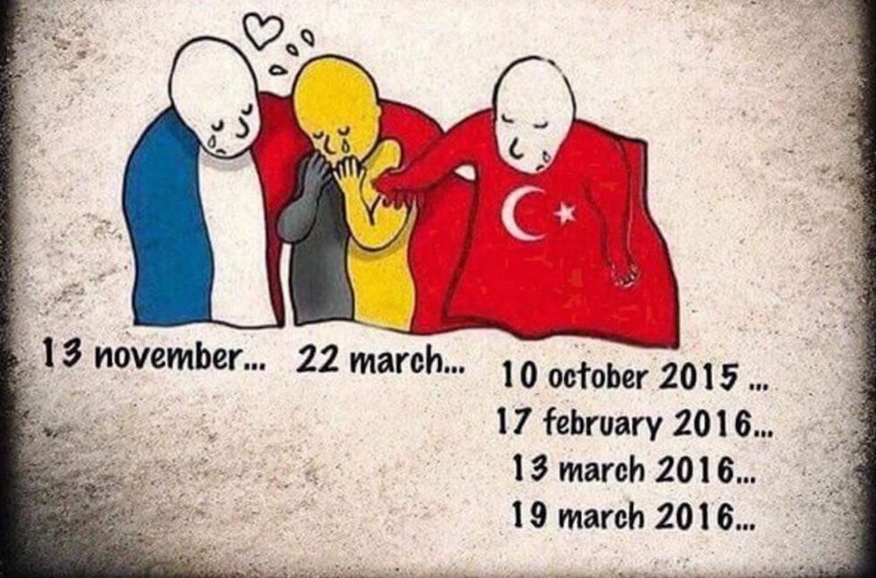
But for every message of goodwill, every well-meaning hashtag and famous landmark lit up in the colours of the Belgian flag, there have been questions raised in countries like Turkey, Iraq, Afghanistan, Nigeria and Syria who wonder where our sympathy was for them when similar - and in some cases more severe - tragedies hit their homelands.
While some argue that geographical proximity has made people feel more strongly about events in Brussels - as they did in Paris in November - others say those in the West just don't care about people in other parts of the world.
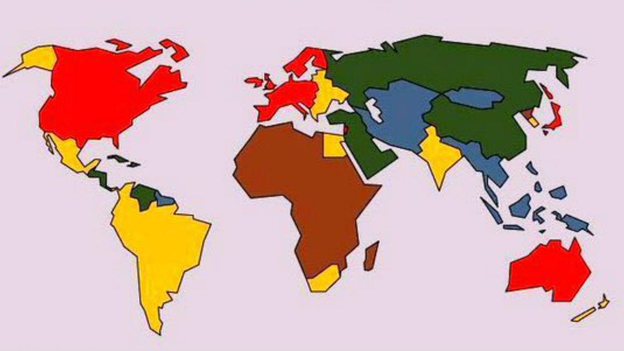
As a result, this colour-coded map, which critiques the supposed response to tragedy depending on its location, has been widely shared on social media:
The "Tragedy World Map" (or "Mapamundi Tragico") was created by Mexican designer Eduardo Salles, who first posted it in April 2015:
That post came shortly after more than 140 people were murdered by al-Shabaab in Garissa, Kenya - a tragedy which has been oft-cited as an example of a tragedy which saw a lack of sympathy from the West.
It has since been re-shared heavily this week in the wake of Brussels - as well as this cartoon by people in Turkey who felt similar recent attacks in Ankara and Istanbul went relatively unnoticed:
HT Ian Bremmer
More: Turkish people are sharing this cartoon asking where our sympathy was for them