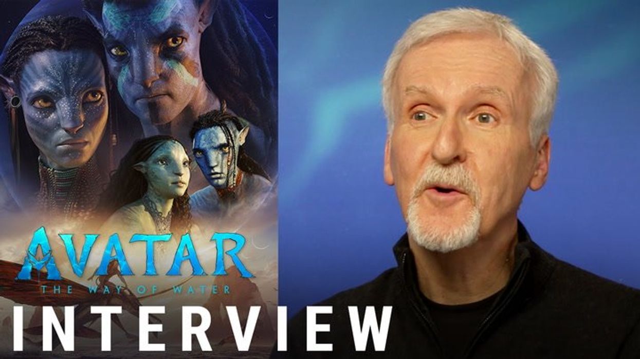
It’s the highest grossing film of all-time, but in 2017 the fantasy movie Avatar was mocked by Ryan Gosling in a Saturday Night Live sketch when he played a man who realised that the big budget production from 2009 actually just used the typeface Papyrus - a pretty common one you can find on Microsoft Word.
Playing a man named Steven, the Barbie actor joked that the creator of the logo for the CGI film “just highlighted Avatar, he clicked the drop-down menu, and then he just randomly selected Papyrus, like a thoughtless child wandering by a garden, yanking leaves along the way”.
Avatar director James Cameron acknowledged the skit in an interview with Empire magazine for its January 2023 issue, during which he said: “Just think of how much we could have grossed if it wasn’t for that damn font.
“I was not aware that our font was an off-the-shelf thing; I assumed the art department or the title company came up with it. Of course, it was trolled mercilessly as a lazy choice, but frankly, I like the font.
“Ryan Gosling needs to get out more, instead of freaking out over our font. Time to move out of your mom’s basement, Ryan!
“And if Papyrus resonates with the issues of indigenous cultures in the public consciousness, then that fits well with ‘Avatar’, so I’m not losing any sleep over it.”
Well, in his latest stint presenting SNL on Saturday, Gosling reprised his role of the distressed soul for “Papyrus 2”, in which Steven is initially relieved to know the graphics team behind Avatar “changed it” for the film’s 2022 sequel, claiming it “made me feel like there was hope in the world, like maybe, if we raised our voice, change can happen”.
Except, sat in front of a computer with a Word document in front of him, he went on to realise that “they just put it in bold”.
“All of the money in the world and they just put it in bold,” he cries.
And Twitter/X users have loved the gag’s return, branding it pure "cinema":
So, does Steven have a point? Is the art for Avatar: The Way of Water just Papyrus in bold?
The similarities are certainly striking, but there are some noticeable differences. The horizontal line on the ‘T’ is a lot straighter than Papyrus’ slanted version, and the central line of the ‘A’ arcs upwards on the film logo as opposed to a more level ‘A’ in Papyrus.
It’s also a lot thicker than just the standard bold in Word – maybe the ‘extra bold’ or ‘heavy’ version brings you closer to the Avatar text.
Either way, the sketch formed part of a wider SNL episode which has received widespread praise from viewers, with Gosling’s Barbenheimer-inspired monologue – involving a parody of Taylor Swift’s “All Too Well” - dubbed “one of the best”, with Swift herself voicing her love for the cover.
Sign up to our free Indy100 weekly newsletter
Have your say in our news democracy. Click the upvote icon at the top of the page to help raise this article through the indy100 rankings.
