The Conversation (0)
Top 10 Mandela Effect Examples In Logos
Indy
Logos are obviously designed with great care, not just in order to look good, but to convey as much information as they can about the product or service they represent.
Many of them have hidden meanings.
Sign up to our new free Indy100 weekly newsletter
If you're more visually literate, apologies if some of these are obvious.
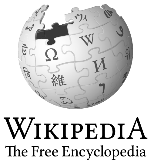
1. Wikipedia
 Picture:
No it's not the death star under construction. According to Wikipedia itself, the incomplete nature of the logo represents the unfinished nature of the project. In addition to articles it also refers to the languages yet to be rendered, as the existing 'glyphs' on the jig saw pieces are the first letter of 'Wikipedia' in the languages Wikipedia in which articles are already available.
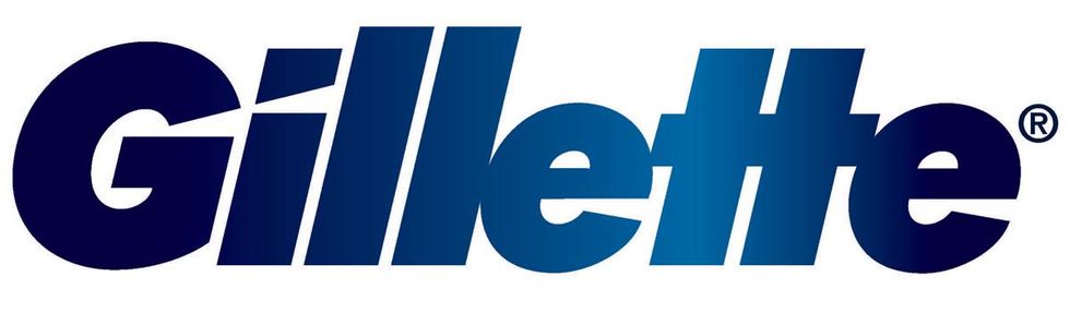
2. Gillette
 Picture: Gillette
Gillette's razors are so sharp they even chopped the logo a bit. The 'G' and the 'i' in Gillette are each sliced at an angle, like when you accidentally cut your finger tips attaching the thing.
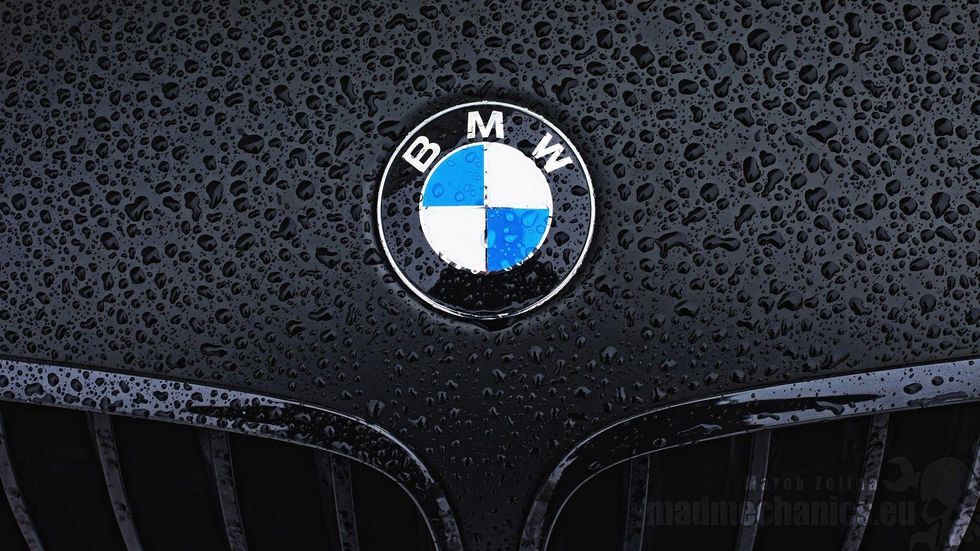
3. BMW
 Picture: BMW
The car company has a background in aviation when in 1916 the Rapp-Motorernwerke company (a motorcycle engine maker) took over a smaller company Gustav Flugsmaschinefabrik which made small aircrafts. Some argue that this history is reflected in the logo today. The white and blue of the logo represent a propeller and blue sky at an angle, rather than a check pattern.
This theory has been discounted by the New York Times who say the blue and white represent the colours of the Free State of Bavaria. When the trademark logo was registered in 1929 it was illegal to show a state's colours in a logo, and therefore the colours were switched, and the aviation connection was added at this point.
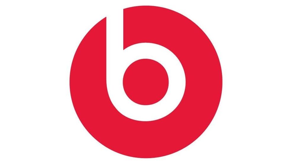
4. Beats
 Picture: Beats
The headphone are themselves wearing headphones. Just look!
5. Hillary Clinton logo
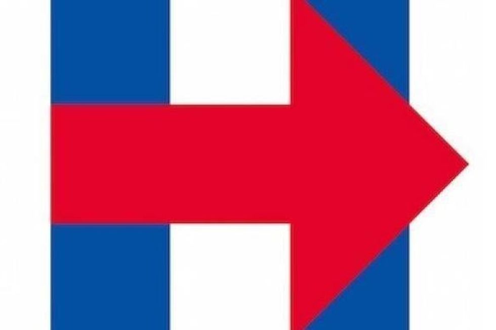 Picture: Hillary Clinton
Logos for campaigns are tricky. They need to be inoffensive, without seeming dull and corporate. The Obama 'O' was lauded at the time, and some claim other companies such as Pepsi subsequently copied the logo (see Pepsi, below). The Clinton logo follows on from the trend set by Obama, simply using a letter rather than a full name. Clinton's one letter logo is timeless (fitting seeing as she's been in politics for a long time), and also very social media friendly.
Some have argued that the red arrow is an odd choice (red is the colour of the Republican party), and the arrow is pointing to the right, when the Democrats are generally the more left wing of the two main parties.
6. Facebook Places
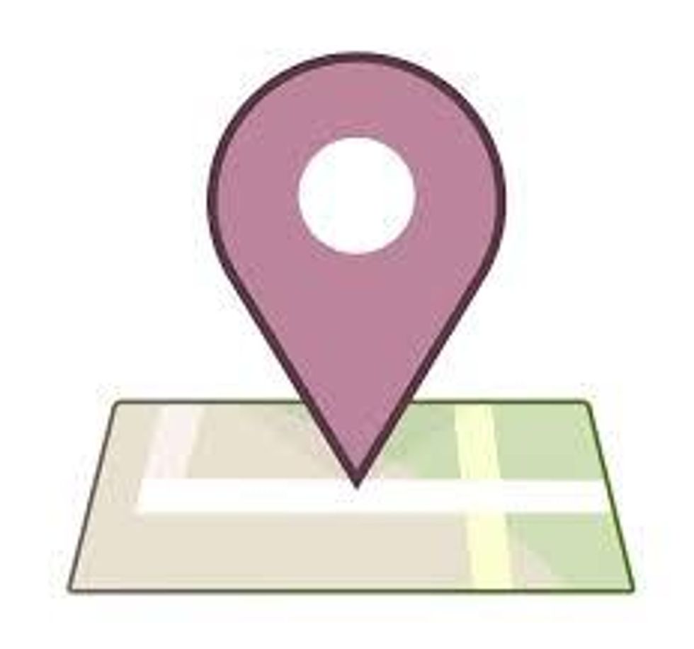 Picture: Facebook Places
On the map of the Facebook Place logo is both a square and a number four, bringing to mind Facebook's competitor FourSquare. Perhaps this is a playful dig, rather than an odd reference to a competitor.
7. Baskin Robbins
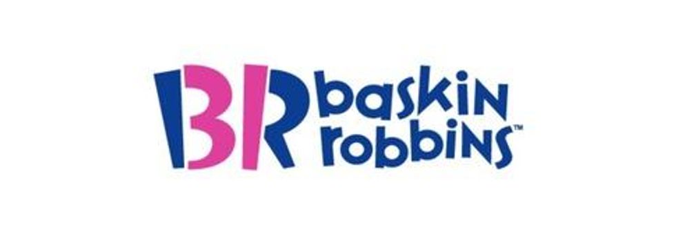 Picture: Baskin Robbins
The popular ice cream company boasts 31 flavours, and so a '3' and a '1' have been incorporated into the logo as a 'B' and an 'R' respectively.
8. McDonald's
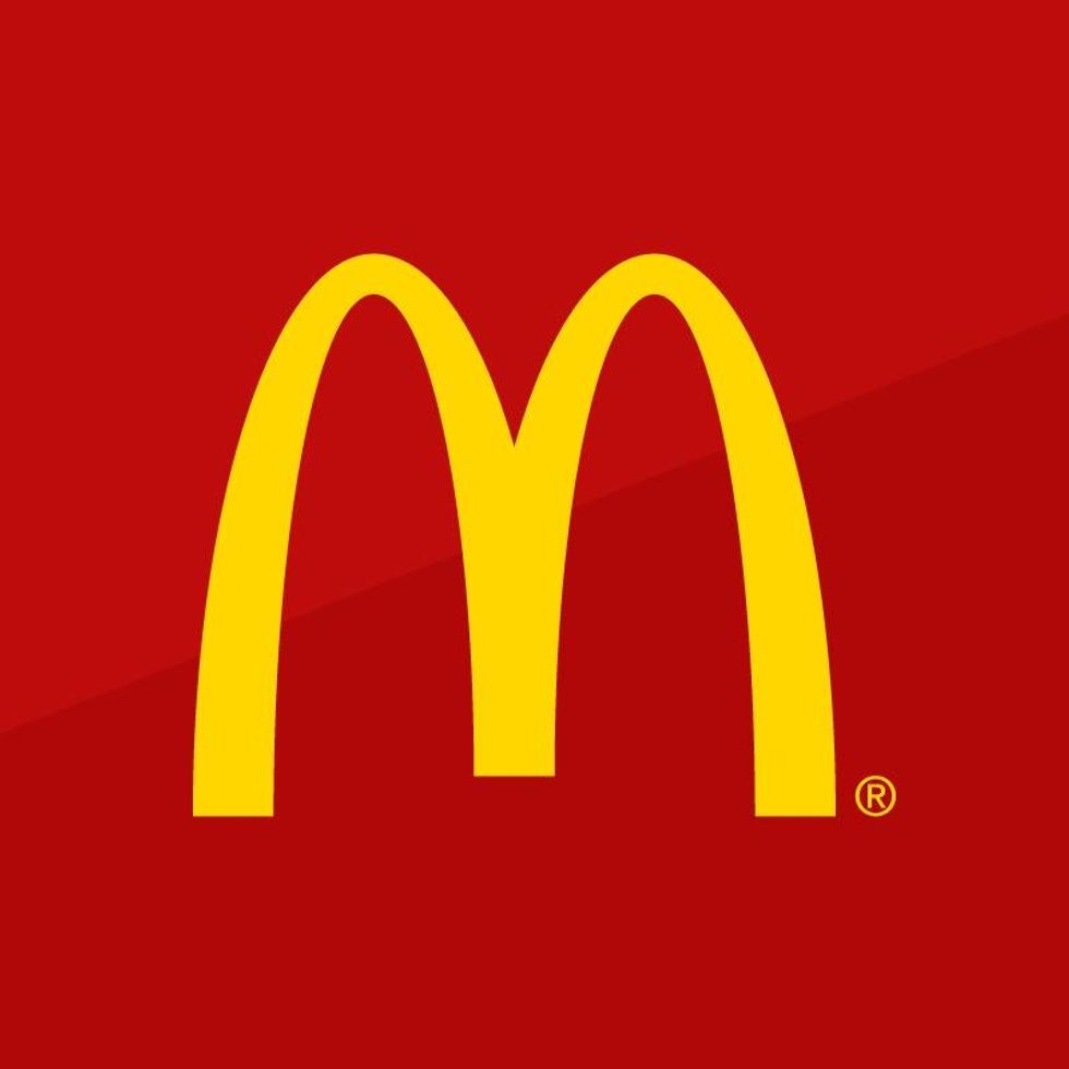 Picture: Mcdonalds
M is just an M and was designed to be an M, but according to the BBC, design consultant Louis Cheskin warned McDonald's not to change its logo when it considered it in the 1960s. Cheskin allegedly cautioned them against the change because he believed that, subliminally, customers saw the golden arches as a pair of nurturing breasts. Whether or not we do, the McDonald's people believed Cheskin and left the M intact.
9. Pepsi
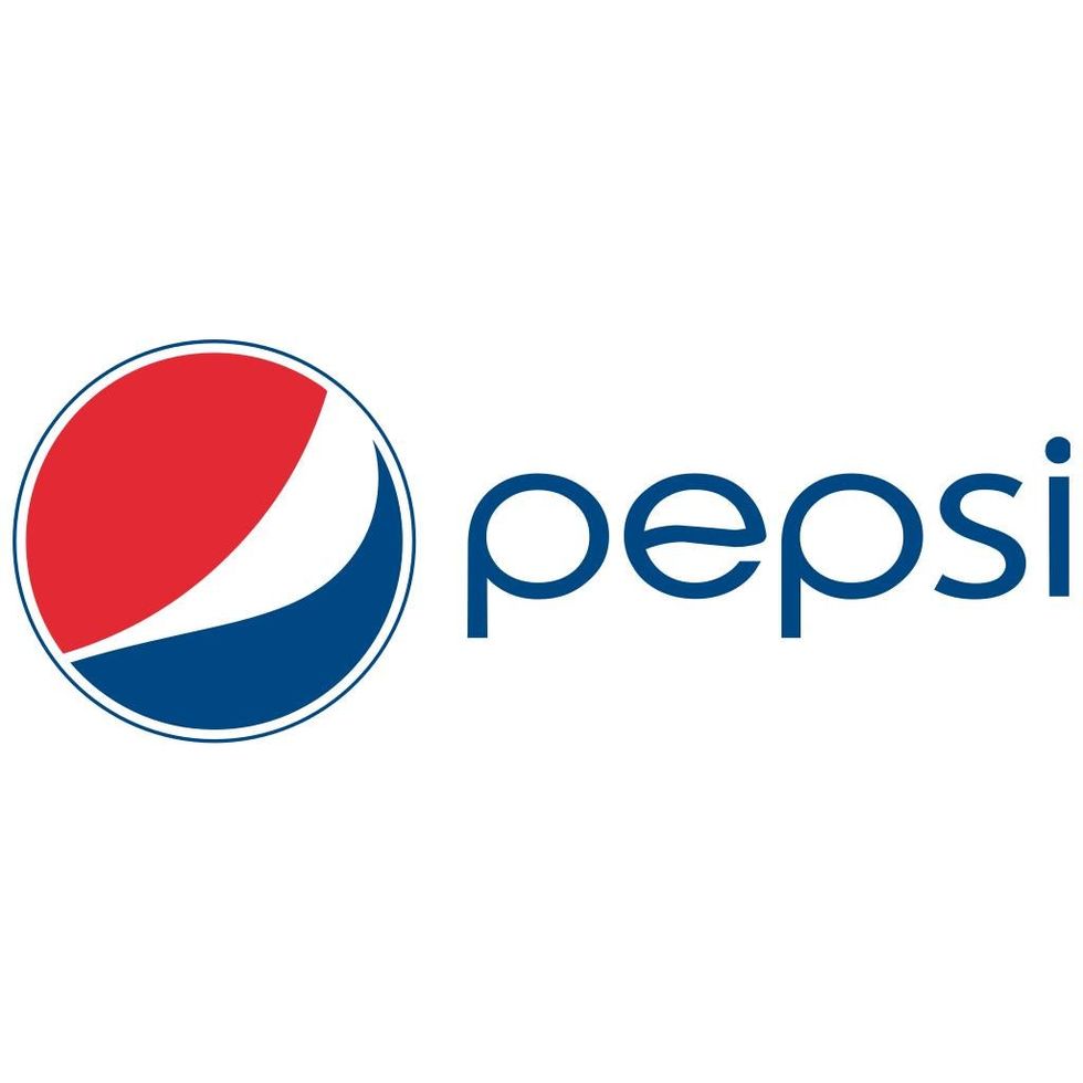 Picture: Pepsi
The designer of the 2008 rebrand of Pepsi claims it represents the Vitruvian man, the earth's geo-dynamo and Feng Shui. A leaked document, seen by Gawker, from the design firm tried to explain why the new logo was like the old logo but askew. It's something to do with 'convention' becoming 'innovation', and the theory of relativity.
10. Toyota
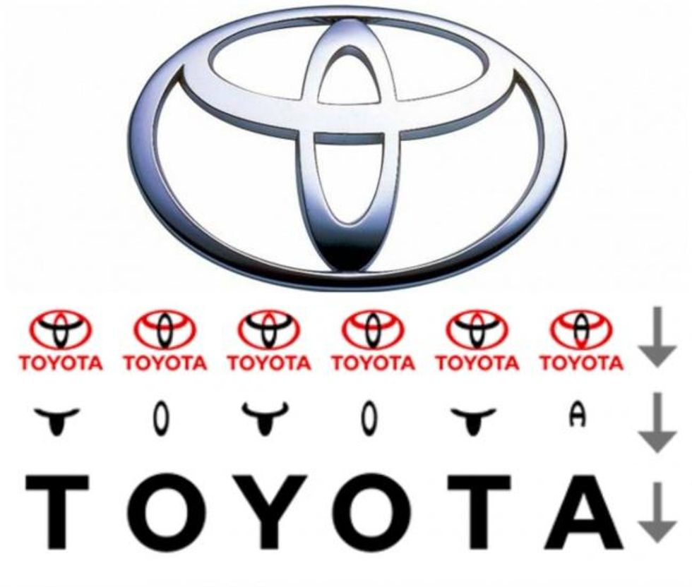 Picture: Toyota
There's a bull/taurus head and an O ring in both the wording and in the logo. This casts doubt on an old joke that the car markers chose 'Toyota' rather than 'Toyoda' because they thought the former sounded classier, without realising Americans would pronounce the 'T' as a 'D'. With a letter 'd' the clever logo would not work.
11. Adidas
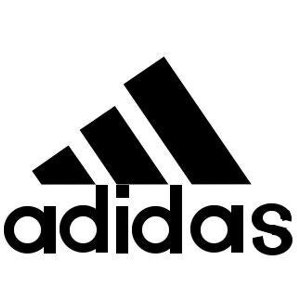 Picture: Adidas
This is another logo with a redesign and retrofitted meaning. In the 1990s the three Adidas stripes were rotated ever so slightly. The new slant was to resemble a mountain. This isn't to suggest they're mountaineering footwear, but it's meant to represent the obstacles a person can overcome.
12. Apple
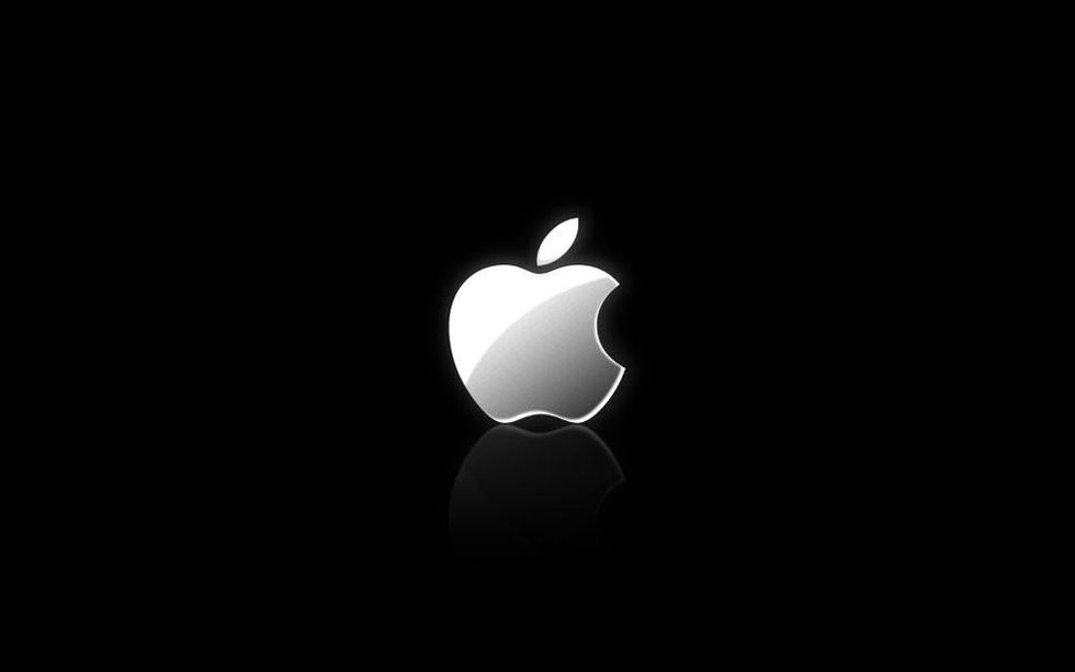 Picture: Apple
It's the forbidden fruit from the tree of knowledge. And that worked out great for Adam and Eve. So an odd choice, especially as a snake isn't the most positive allegory for the product provider. According to a series of articles by Jens Hofman Hansen the logo is Biblical but also much more. The original Apple logo in 1976 designed by Jobs and Ronald Wayne featured Sir Isaac Newton. The redesign to the rainbow coloured Apple that was well known in the 1980s represented Newton's discovery of the visible light spectrum, and 'Macintosh' is a type of Apple. The tree of knowledge plays a part, but it's just one of many meanings. Others have found the golden ratio in the logo.
13. Museum of London
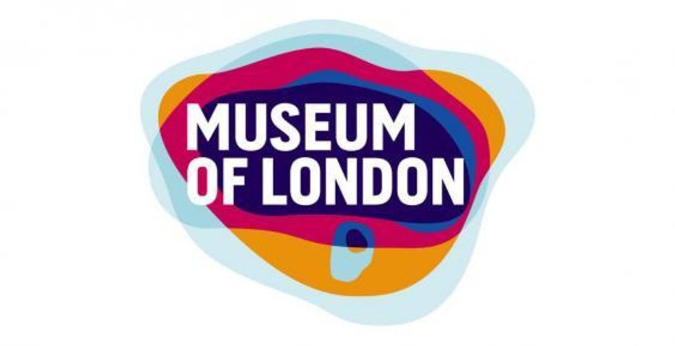 Picture: Museum of London
The logo isn't just some Twenty-Twelve style PR firm bubbles and colours nonesense, each colour outline supposedly represents the city limits throughout its history.
14. Monster
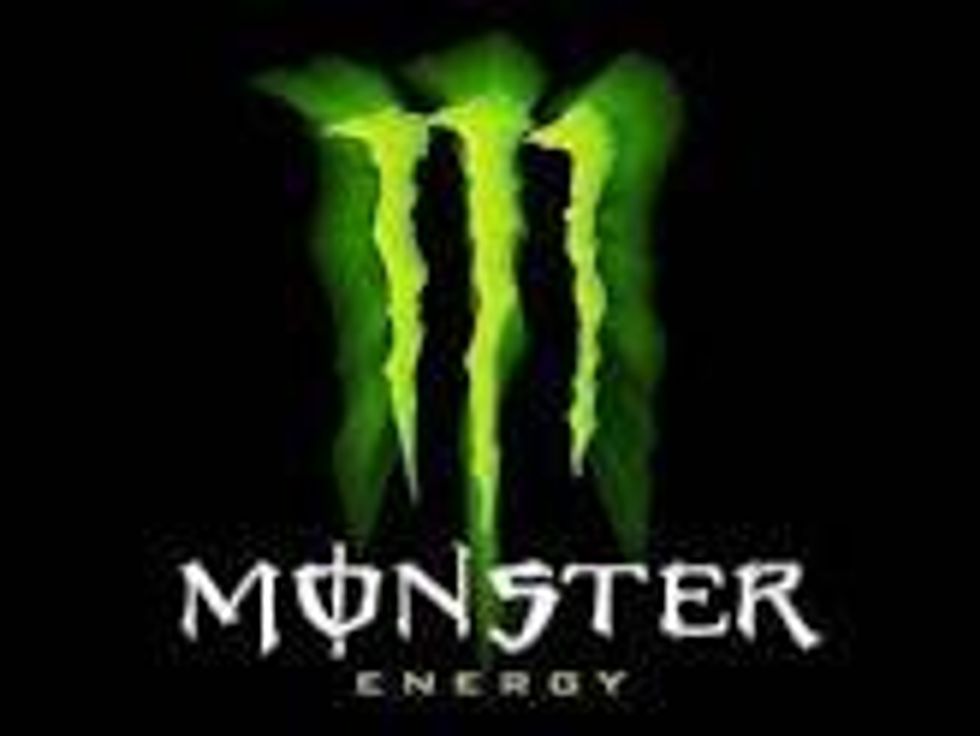 Picture: Monster
This isn't an official theory, more one from the Illuminati brigade. Each leg of the 'M' on the Monster drinks can resembles the symbol for 'Vav' or '6' in ancient Hebrew. As such the side of the can reads '666', the number of the beast. This ties in to its branding which includes the slogan 'Unleash the beast'. So rather than the illuminati gang rumbling a satanic cult that's poisoning our minds, they've uncovered some lame marketing.
15. US Cyber Command
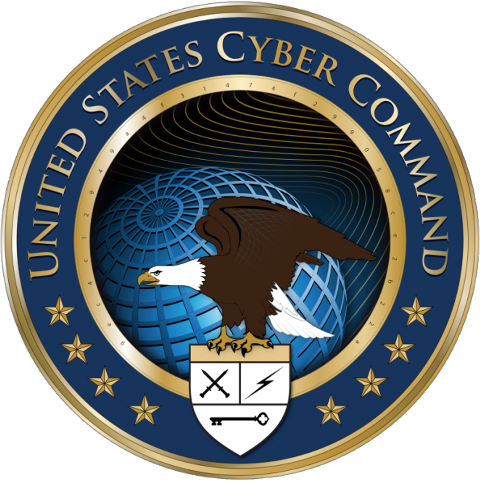 Picture: US Cyber Command
There is 32 characters of code around the inner gold ring of the emblem for US Cyber Command, a unit of the US Department of Defense. Close examination of the code reads:
9ec4c12949a4f31474f299058ce2b22a
According to The Australian the code was cracked by users on Wired.com and many others. The meaning was rather dull. It was the mission statement for the unit.
USCYBERCOM plans, coordinates, integrates, synchronizes and conducts activities to: direct the operations and defense of specified Department of Defense information networks and; prepare to, and when directed, conduct full spectrum military cyberspace operations in order to enable actions in all domains, ensure US/Allied freedom of action in cyberspace and deny the same to our adversaries.
16. Game Cube
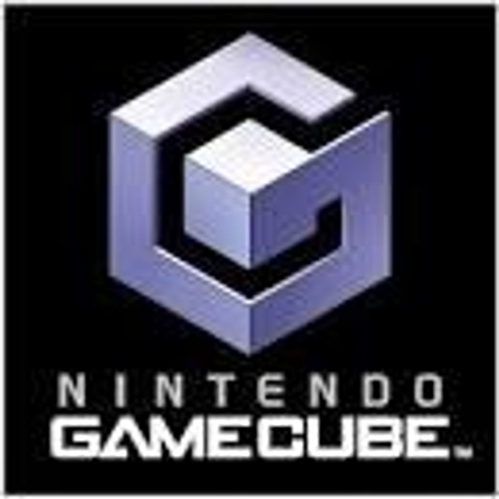 Picture: Game Cube
The dead space created by the letter G makes a C.
17. Hope for African Children Initiative
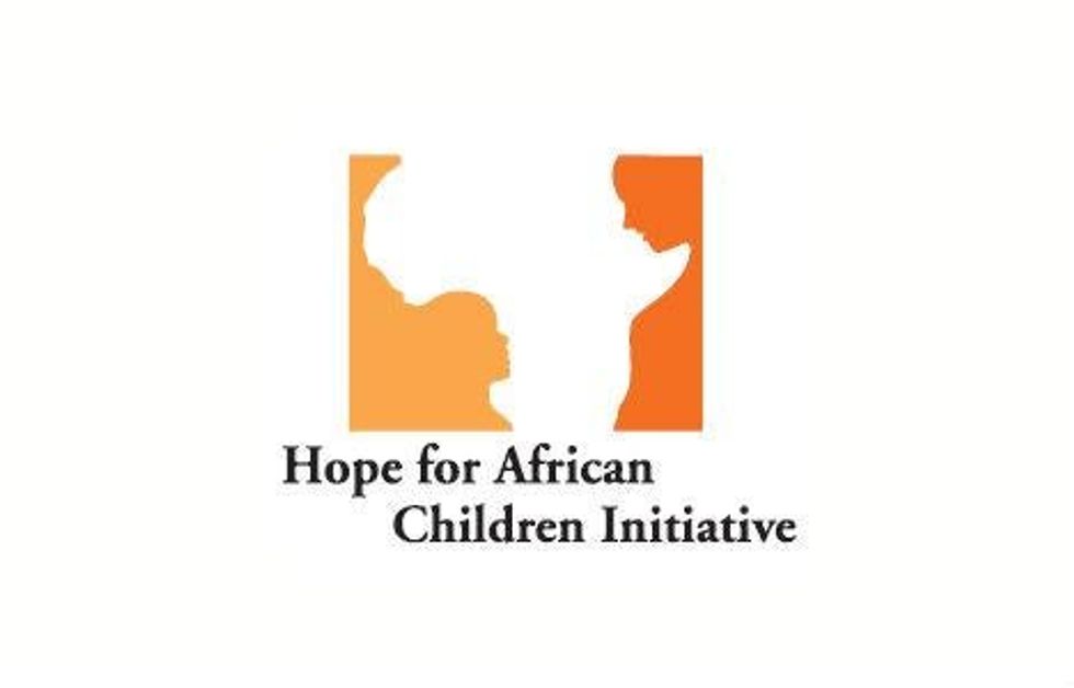 Picture: Hope for African Children Initiative
As well as showing you the continent of Africa, this logo shows a child on the left looking up to an adult on the right.
18. London Symphony Orchestra
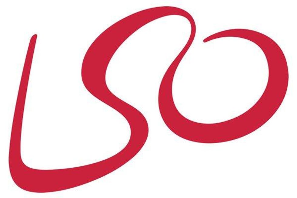 Picture: London Symphony Orchestra
As well as spelling out LSO, the image resmebles a conductor at work.
19. Formula 1
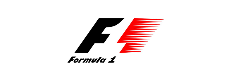 Picture: Formula 1
This logo has a number ‘1’ hidden in the space between the F and the red speed lines.
20. Carrefour
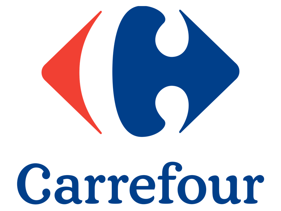 Picture: Carrefour
The French chain of supermarkets is named Carrefour, which translates to ‘crossroads’, which would explain the two arrows in the design.
21. Goodwill
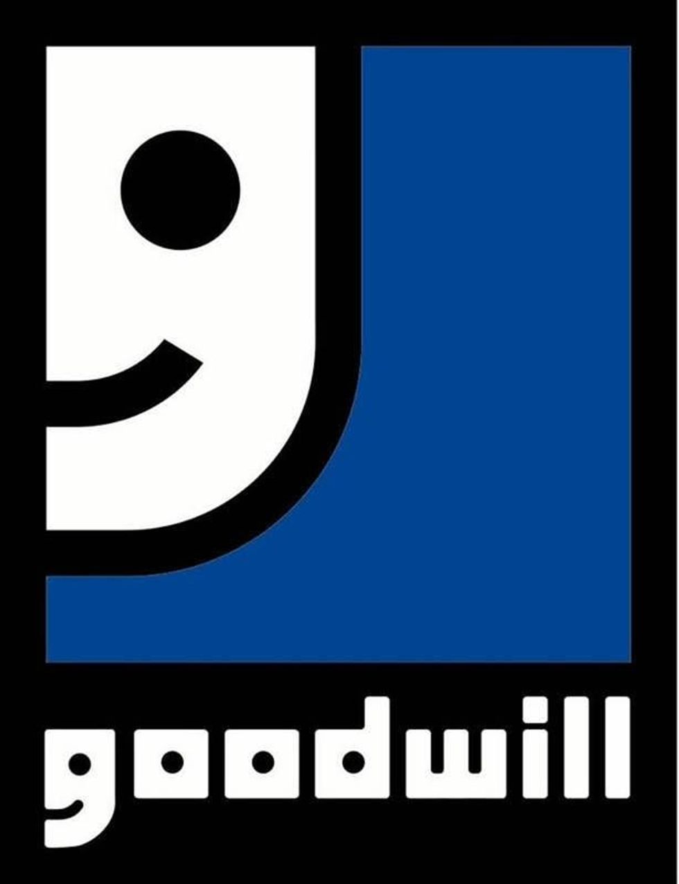 Picture: Goodwill
The American non-profit organisation has a logo which features a smiling face. What not many people notice, however, is the ‘g’ in Goodwill is a half of a smiling face.
22. Hyundai
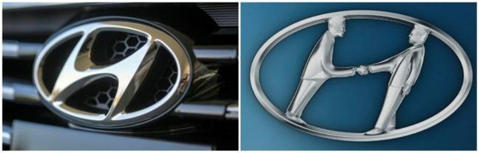 Picture: Hyundai
Not just an H, the car badge also represents two people having a handshake.
23. Domino's
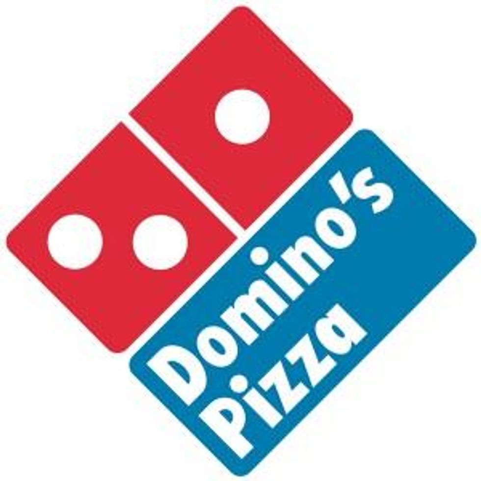 Picture: Domino's Pizza
The domino on the Domino's logo is obvious. But the number of dots represents the first ever Domino's restaurant (then called DomiNick's) in 1960, and then the two franchises which were opened in 1965.
24. Paramount
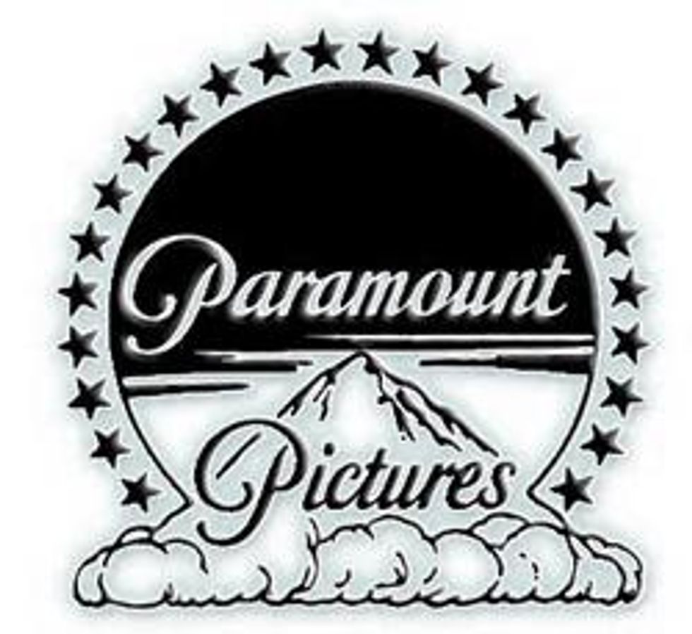 Picture: Paramount Pictures
The original 24 stars that surround the image of a mountain, represented the 24 film stars were officially attached to the studio when the logo was designed in 1917.
25. NHS Organ Donor card
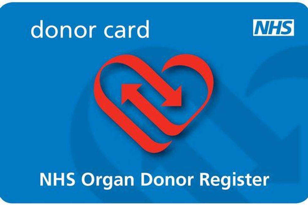 Picture: NHS Donor Card
The card is both an image of a heart, and two arrorws passing one another, representing exchange.
26. Flight Finder
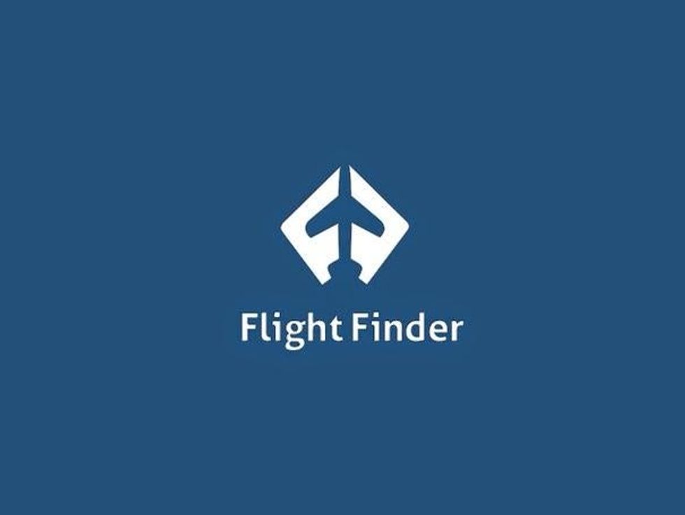 Picture: Flight Finder
The two ‘f’s side by side, create the shape of an aeroplane.
27. Shelter
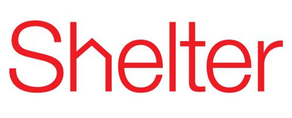 Picture: Shelter
The housing charity slips a tiny house into the logo, in place of the letter 'h'.
28. Dell
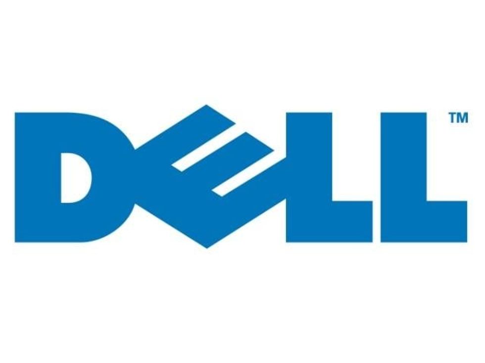 Pictures: Dell
The oddly angled 'E' in Dell has two possible meanings. Some say it represents a floppy disk (Dell was founded 1984), but Business Insider reports a story regarding the founder Michael Dell, who allegedly wanted to 'turn the world on its ear', which makes very little sense.
29. Pinterest
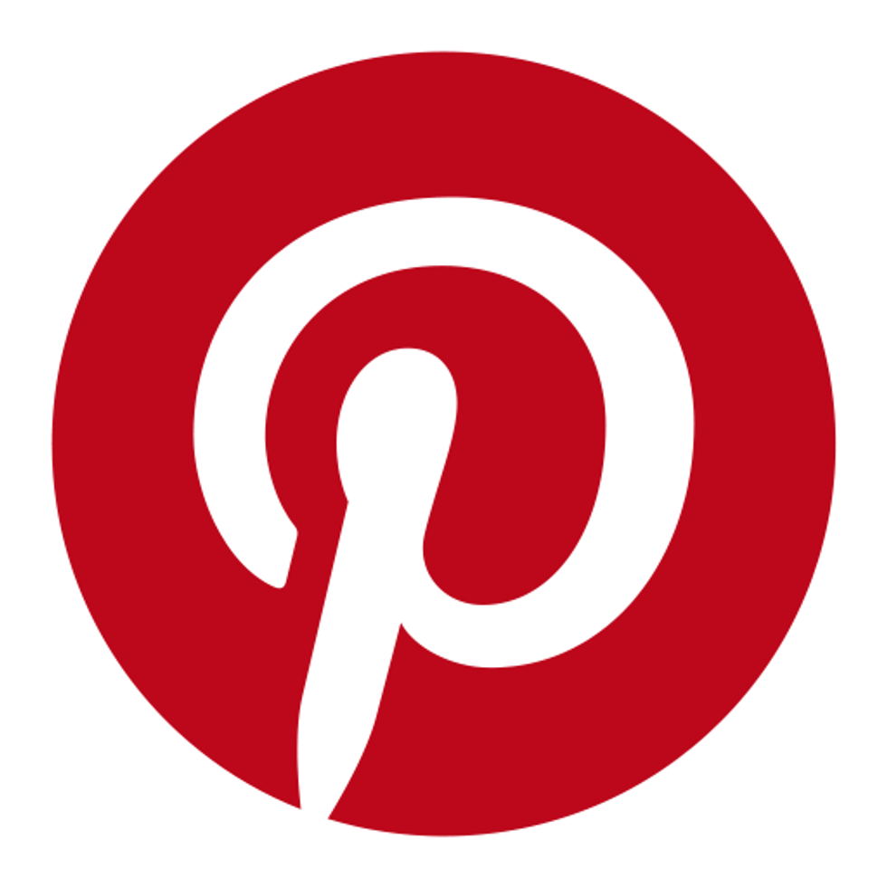 Picture: Pinterest
The photo-sharing website and app helps you catalogue ideas by ‘pinning them’ onto your page. The ‘P’ in the logo is also in the shape of a pin.
30. Häagen-Dazs
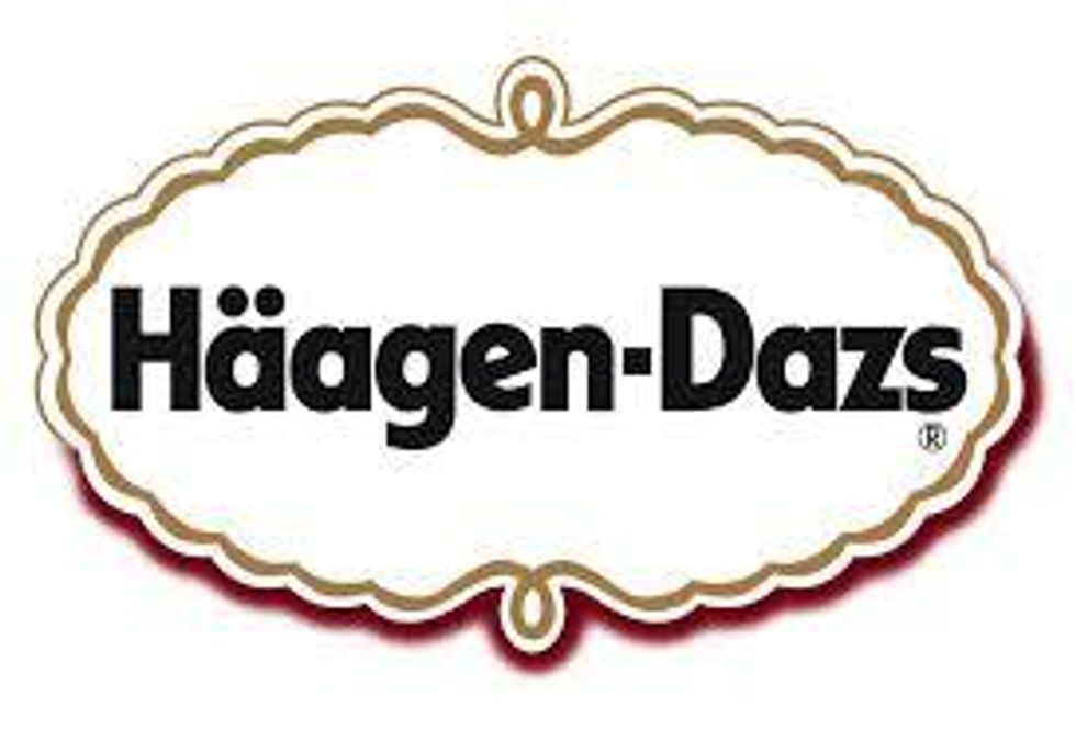 Picture: Häagen-Dazs
This is more of an honourable mention, but it still has a startling revelation. Hagan-Dazs is not something in another language, nor is it a person's name. It means nothing.
Your ice cream is nothing.
Have your say in our news democracy. Click the upvote icon at the top of the page to help raise this article through the indy100 rankings.
Top 100