The Conversation (0)
Viral
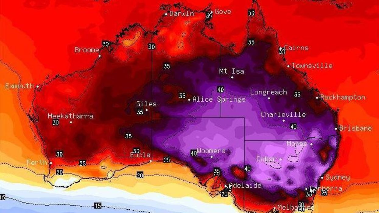
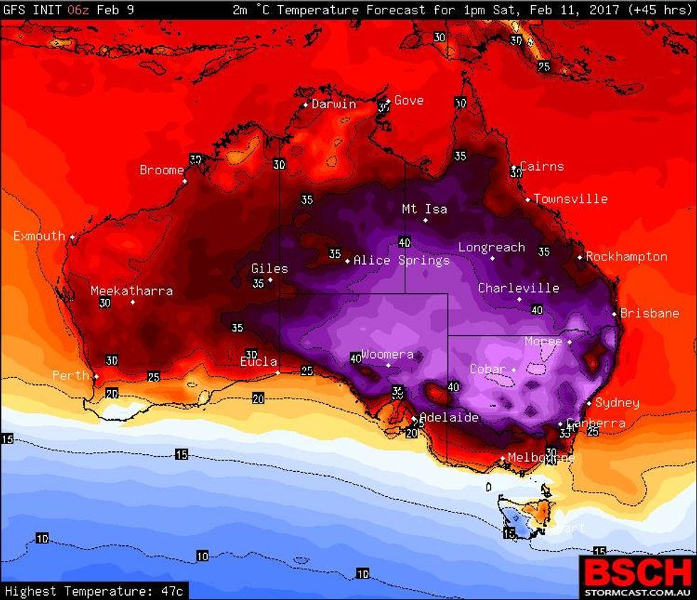
Australia is about to get toasty.
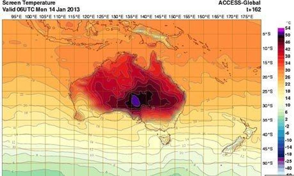
Back in 2013 Australia’s Bureau of Meteorology added a new colour to the top of its temperature scale, in response to some of the highest estimated temperatures ever recorded at the time.
Four years later and meteorologists are estimating the biggest heat wave in the history of Australia.
What does this mean? A whole lot of purple.
The colour indicates the highest heat levels.
 Picture: stormcast/screengrab
 Picture: stormcast/screengrab
Temperatures will reportedly skirt 50 degrees Celsius, with the South of the country particularly feeling the heat.
New South Wales (NSW) police announced a Heatwave Action Plan for the coming days, and they are advising people to limit physical activity, avoid alcohol and sugary drinks, and stay indoors when possible.
They also urge people to pay special attention to children and elderly people and those who live alone – as they are the most vulnerable.
More: People in Iceland are annoyed at the weather forecast and not for the reason you think