The Conversation (0)
Viral
In an average audience of eight men and eight women, there's a 50 per cent chance that at least one person has a degree of colour blindness.
A reddit user, Renno Hokwerda, posted a brief series of maps to Imgur to highlight the difficulties faced by some in interpreting colour coded maps.
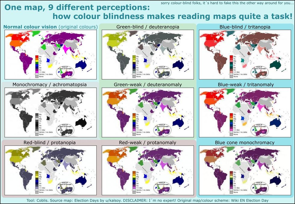
Hokwerda told indy100 that he used Coblis, an online tool which attempts to replicate how some colour-blind people will see certain images:
I am not an expert on colour-blindness at all, nor am I myself colour-blind. I posted last Sunday a map on Reddit r/mapporn showing the world's general election days, to which I added a textual key for colour-blind people who perhaps wouldn't be able to read the map.
That key sparked many people's interest in colour-blindness and some colour-blind people responded gratefully, which gave me the idea to produce a map the way colour-blind people see.
I wanted to convey a message, a sense rather than perfection of 'this is 100 per cent what 'they' see'.
As Hokwerd says, the tool is not 100 per cent accurate, nor does it cover all forms of colour-blindness, but it does serve as a decent introduction to the subject.
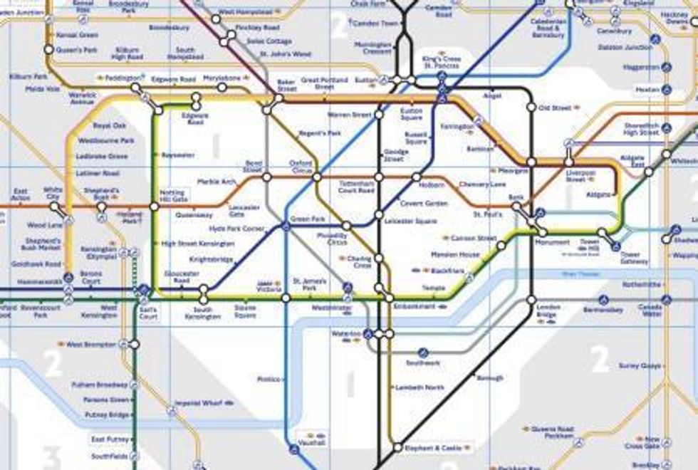
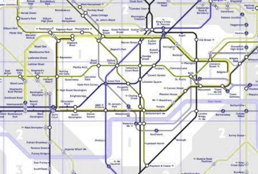
You can use the tool, as we have below, to reproduce images with a certain colour palette.
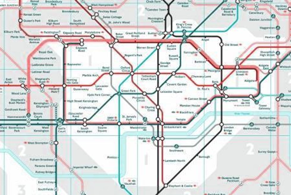
Look at how the London Underground map, for example, appears with different perceptions of colour.


Colour blindness affects a significant amount of the population - but numbers vary in different countries and by ethnicities and genders.
For example, a 2006 study found that in the US around 7 per cent of the male population cannot distinguish red from green, or see red and green differently from how others do, compared to only 0.4 per cent of the female population.
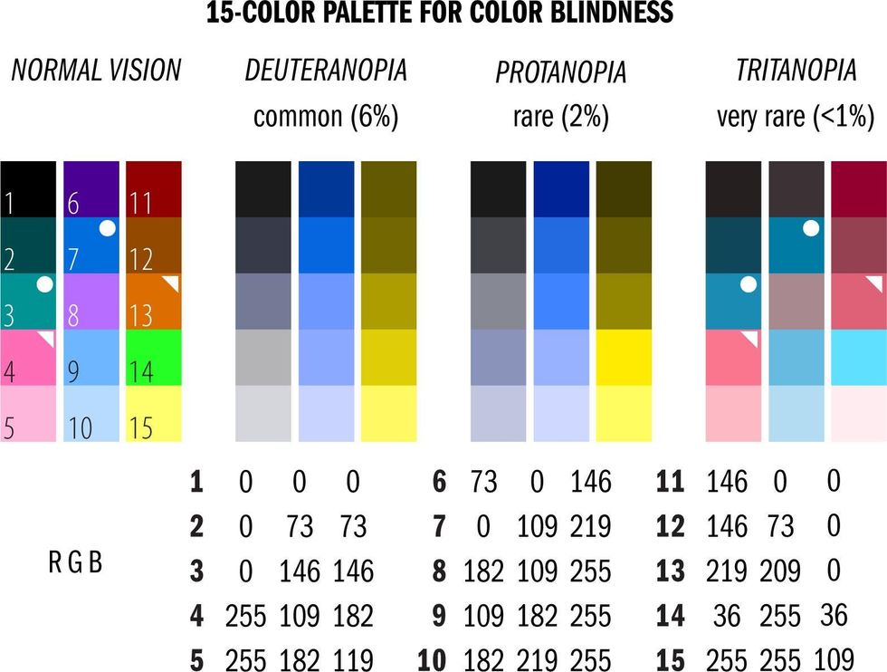
A good way to colour code, if needed, is to stick to yellow-blue colour combinations, or to use the below 15 colour palette, produced by Canada's Michael Smith Genome Sciences Centre.
The palette provides good discrimination for common types of colour blindness, allowing as many people as possible to read your chart or map or graphic.
More: These are the world's favourite colours
More: This gif will make you go temporarily blind (sort of)
More: Woman who sees music as colour shows you what your favourite songs look like