


The Conversation (0)
Joe Vesey-Byrne
May 24, 2017
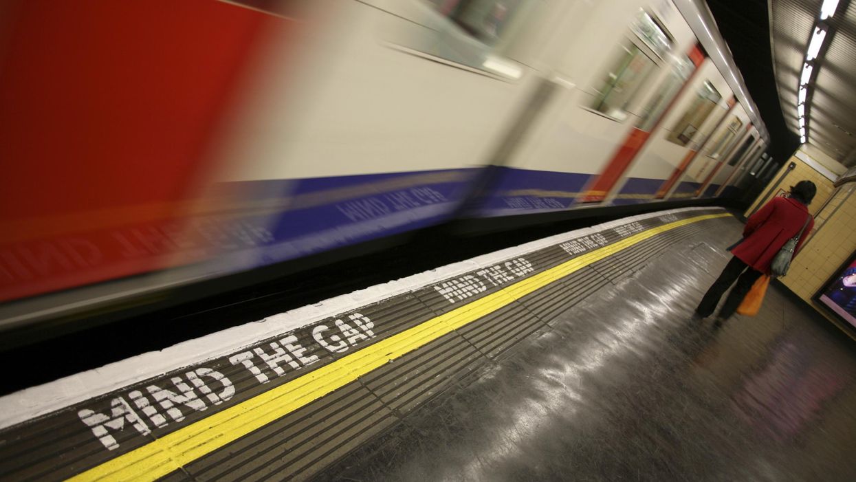
A 'work to rule' will begin on 7 March
Picture: Matthew Bowden/istock
The design by Harry Beck, which has stood the test of time, was first introduced in 1933.
It's success has been attributed to the ease with which it can be read, despite the lack of a consistent scale.
The sprawl of the London Underground out into the suburbs means that if you were to use one scale that took in every stop, the sections showing central London would be completely unreadable.
The coherence of the design has seen it exported to metro systems around the world.
This gif compares the Beck design to where the London Underground actually goes.
Among other things, the mesmerising gif shows how close the end of the Wimbledon branch of the district line is to the south end of the Northern line, and also that the Central line veers off to the north west once it's out of central London.
The same disorienting effect can be applied to the world's other underground systems, which have often cribbed off Beck's design.