


The Conversation (0)
News
In 2017, it's hard to come across a bit of good news.
However - thanks to Max Roser, a researcher at the University of Oxford - there is a little bit of good news.
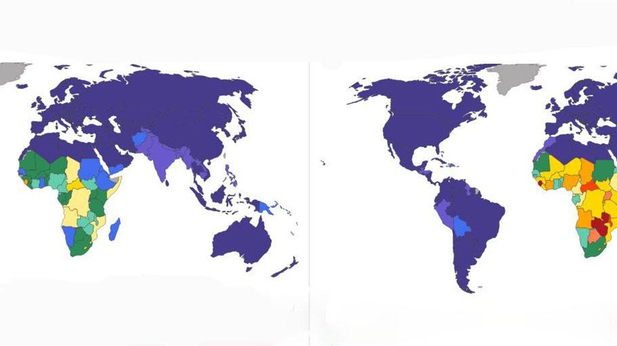
Roser created this data visualisation from World Health Organisation statistics, that shows the change in burden of disease from 2000 to 2012.
The burden of disease is measured in Disability Adjusted Life Years (DALYs) lost. "One DALY lost" is the equivalent of losing one year in good health because of either premature mortality or disability.
Looking at health outcomes in terms of both mortality and morbidity gives a better view of health outcomes that life expectancy alone.
The above maps show the "disease burden due to communicable diseases". Communicable diseases are often curable - so the increased odds are due to better public health and show how far we have come in improving global public health.
This burden is easier to reduce and has improved significantly since 2000. However, many poor countries still suffer from the burden of these diseases.
DALYs has also improved hugely sie the turn of the century, but there is still significant work to be done.
The Global Burden of Disease estimated that in 2013 10.7% of potential healthy life years were lost due to disease and disability.
You can read more about it at Our World in Data.