News

11 maps and charts that help explain post-Brexit Europe

11 maps and charts that help explain post-Brexit Europe

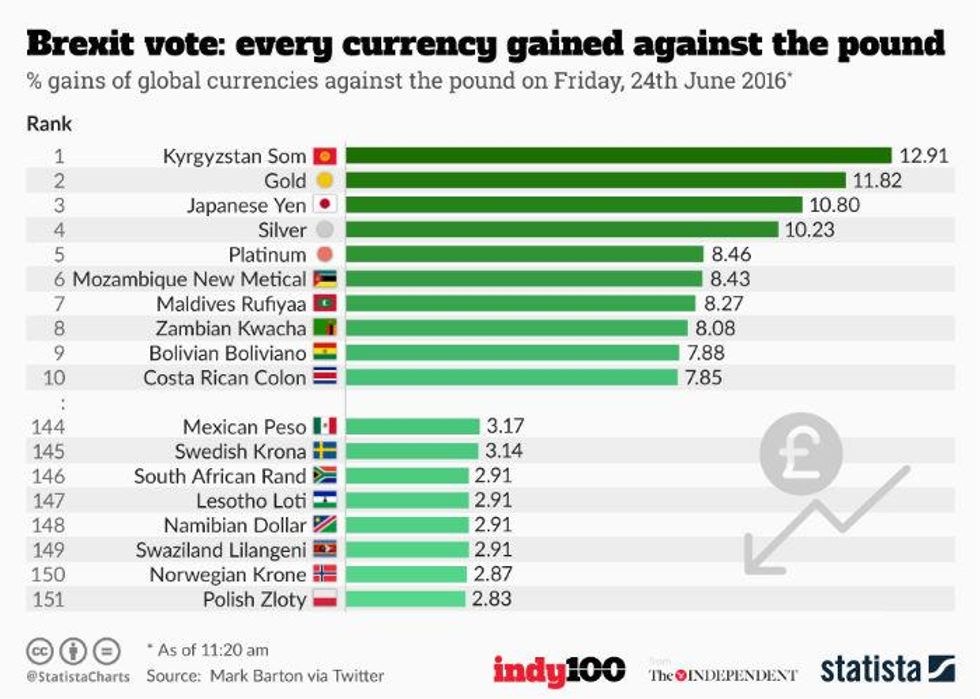
Brexit happened, and it was all a bit fast.

So, to slow things down and recap, here's a brief guide to the vote and its immediate aftermath.

1. The UK voted Leave. Some parts of it, at least.

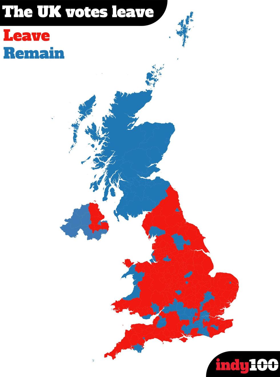
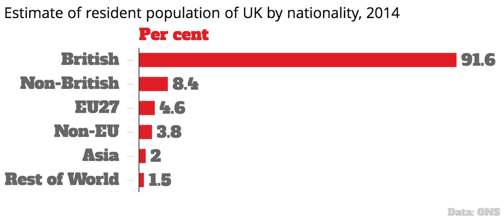
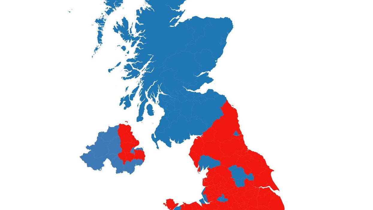
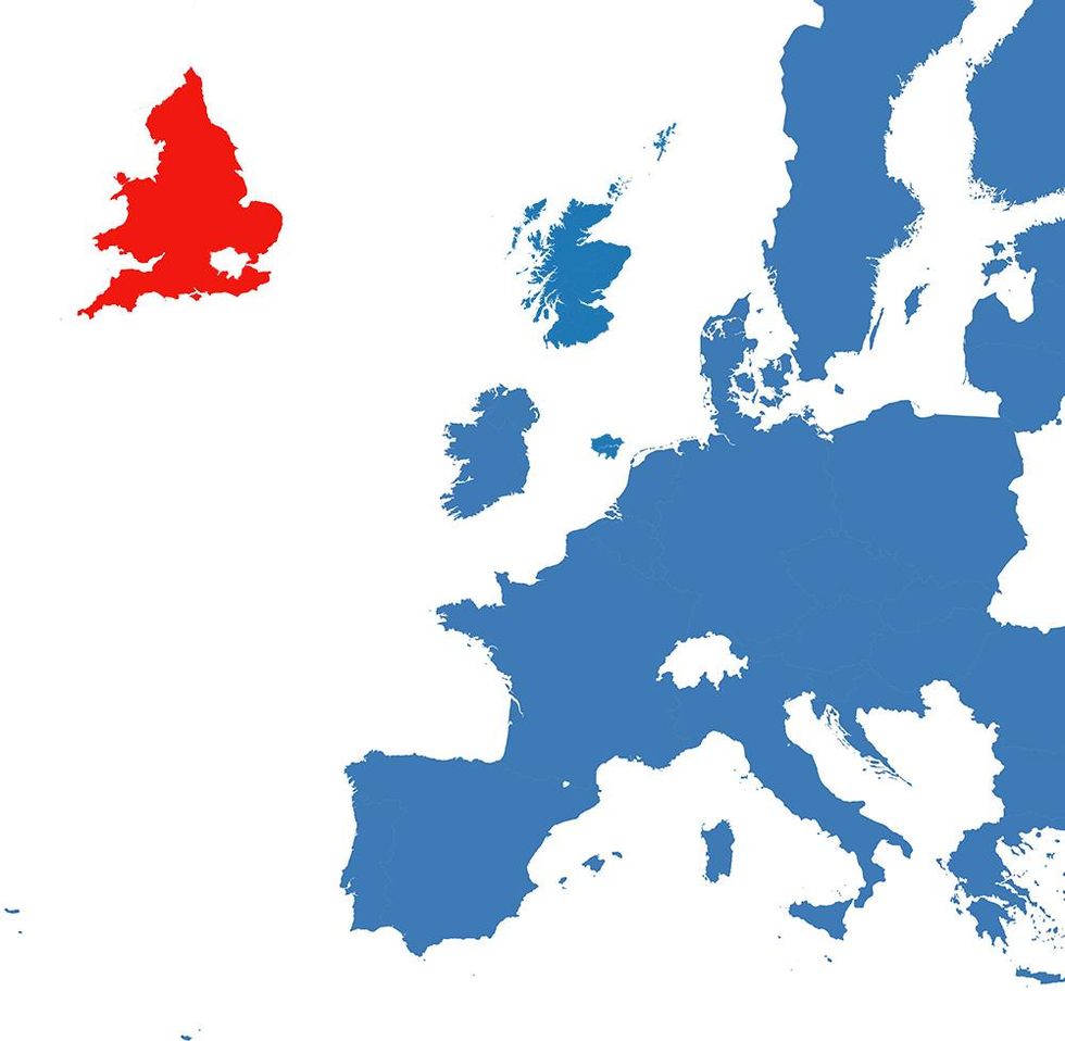
We discovered the United Kingdom was a lot less united than we thought it was, based on the way they voted.
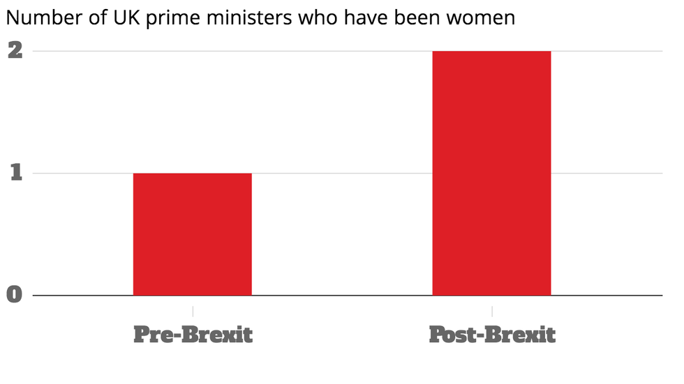
And thus...

2. We have a new map of Europe

Picture: Carto/indy100

3. Currencies gained against the pound in the immediate aftermath.

4. While other Eurosceptic politicians on the continent leaped on anti-EU sentiment to call for their own referenda.

5. And now European countries think it likely that others will leave

6. David Cameron resigned and the UK was granted a new prime minister in the form of Theresa May.

Her party is currently 16 points ahead of Labour in the polls, prompting talk of a snap election.

7. While the UK's EU migrants have an uncertain future after the vote

Article 50 and the cancellation of free movement has not yet been triggered.

8. While EU nationals amount to just over half the UK population

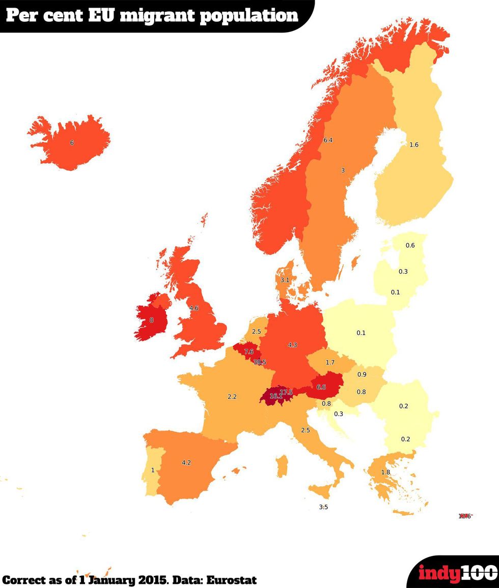
Theresa May has previously talked about cutting migration, but keeping the freedom of movement principle required to stay within Europe's single market.

9. Our economic confidence fell, as YouGov found Britain was hit hardest in the immediate aftermath

10. They also found that no-one wants to give the UK a good deal other than the UK. Oh, and Denmark

11. Freedom of movement is crucial to a deal

More: 15 maps and charts that explain the EU referendum

The Conversation (0)
x