


The Conversation (0)
News
The possibility that Labour are on course for their worst general election in a very long time should be of no surprise to anyone.
The polls have looked abysmal for the party for a while now, and Theresa May appears confident of gaining a larger majority.
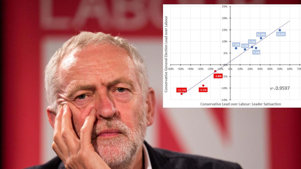
One redditor has argued, using a regression analysis and Ipsos polling data, that leader satisfaction data is a decent indicator for the likely lead in the general election result.
According to his chart it explains roughly 96 per cent of the variance:
In a post explaining his chart he said:
As you can see, the numbers are pretty solid and for all the geekery we engage in, much of the time it boils down to this. Especially when 96% of the variance can be explained by simple leadership satisfaction levels. There are times when the headline numbers make no sense (ala 2015), looking under the bonnet at these kinds of supplementary questions csn at the very least, crystallise, and at most verify and make certain.
There isn't going to be some cliff edge. The Tories are on for about a 20 point election win and whilst there is plenty of time to play, I don't expect this to change, given the historic trend.
Forgive me for not demarcating dates of each set of Tory leads on the chart. Would have made life easier. I forgot. But look across to left of screen for cross-reference.
A decent counterpoint is that leader satisfaction improves when your party polls well.
However, that it remains a good ballpark indicator for a general election result should concern Labour.
HT r/UkPolitics
More: How Labour is failing under Jeremy Corbyn, in 8 charts