The Conversation (0)
News
Transport for London released a new interactive version of the iconic Tube map on Thursday with a few design tweaks and the addition of some new lines.
Here's what's changed:
A thinner font has taken the place of the existing bold, blue variant - which has caused a few spacing problems on the interactive map...
A PDF version of the map on the TfL website still shows the old font and as such the Bakerloo line is looking A-OK.
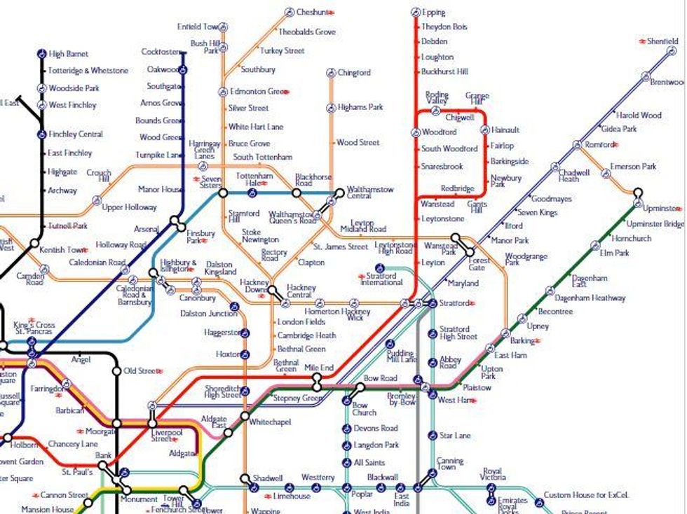
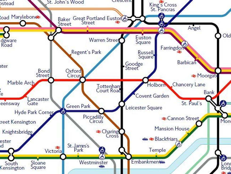
It's still there on the PDF version though.
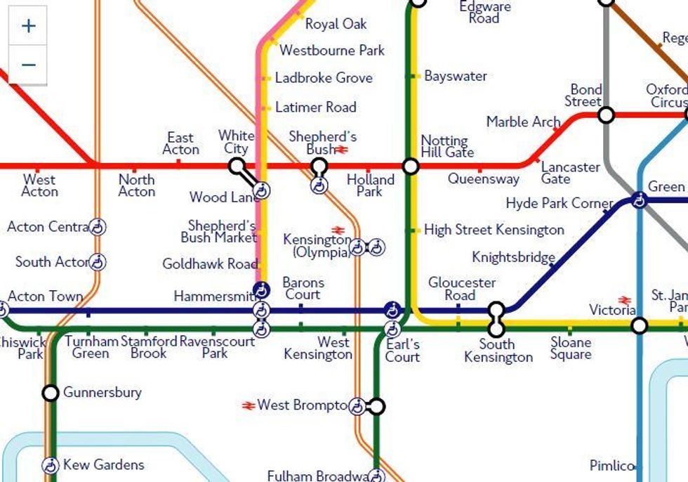
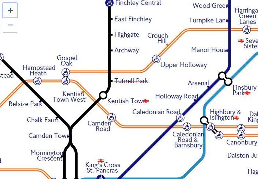
The PDF version of the new map still shows the route so we'll put this down to a clerical error. Although with services on the small District line branch to Kensington Olympia being reduced in 2011, could this be a warning of things to come?
More: The Tube map of the future is here and it is glorious
More: This map shows half a million London Underground journeys in under two minutes