The Conversation (0)
News

Jack Grieve, lecturer in forensic linguistics at Aston University in Birmingham, is probably a f***ing genius.
He created a set of maps showing the popularity of certain swearwords across the US.
The data is based on almost nine billion words from tweets, collected by Diansheng Guo.
The maps show the relative frequency of each word, divided by the total number of words from that place, the blog Strong Language writes.
Here are some of the maps, in which orange means higher frequency of usage:
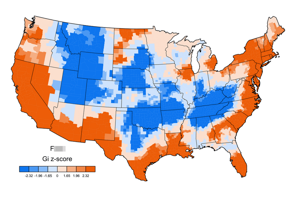
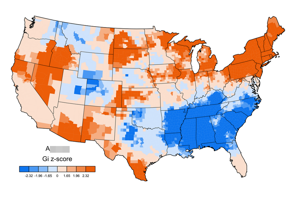
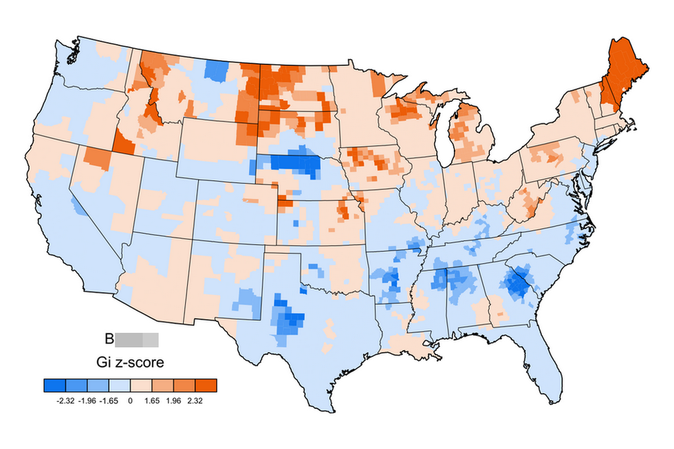
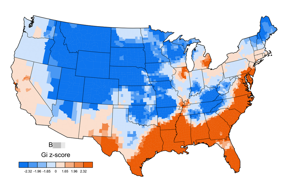
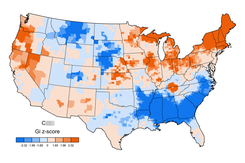
All images courtesy of Jack Grieve.
More: These are the US states with the most STIs
More: A map of the US states earning the same amount as European countries