


The Conversation (0)
Science & Tech
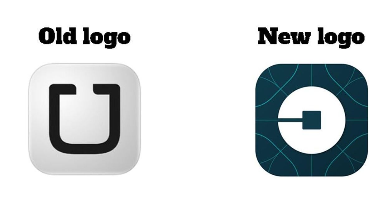
Uber changed its logo on Tuesday in a bid to reflect it is a "fundamentally different company"...
...by launching an unrecognisable logo.
CEO and Co-Founder Travis Kalanick wrote in a press release:
Have you ever looked at someone’s hairstyle and thought 'Oh my, you peaked in the 1990s?' Well that’s a bit how I feel about Uber’s look today.
As a result the company has ditched the old, recognisable U...
...to create a weird, backwards 'c' on a pattern vaguely representing something technologically blue/green and futuristic:
The reasoning behind the logo and font change is to "celebrates our technology, as well as the cities we serve", with designs unique to every city to be implemented at later dates.
Twitter has reacted predominately by pointing out no one can see a 'U' on their screen when looking for the app anymore.
Despite the backlash, it seems Uber is pretty pleased with its new look, signing off the announcement with the following:
And oh yes… hopefully this haircut lasts a bit longer than the last :)
So, apologies to everyone who hates it - we imagine the completely unrecognisable Pac-man is here to stay.