The Conversation (0)
Viral

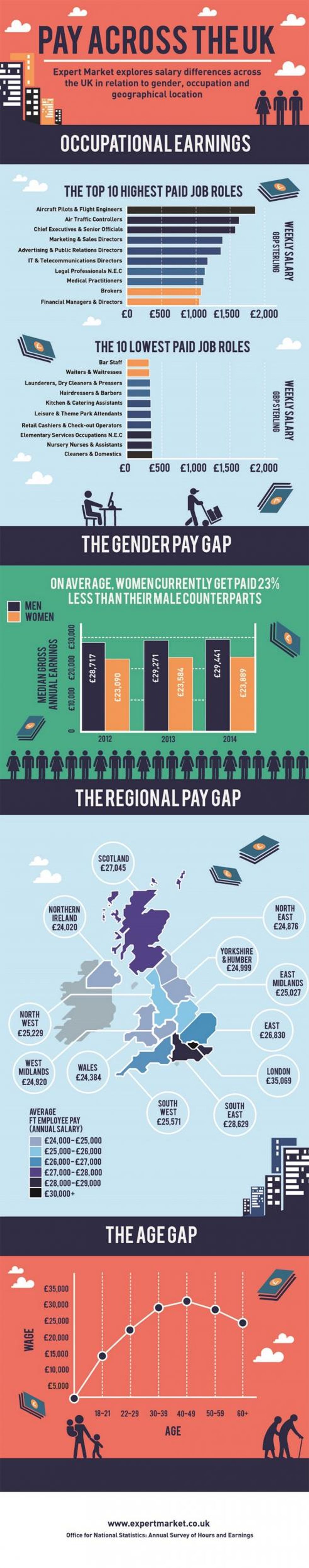
If you're a male aircraft pilot in your 40s working in London, you're probably making a fair amount of money, statistically speaking.
Knowing what you should be paid, or comparing against your industry peers, is important - even just knowing the value of your field is crucial - so it's important to have the knowledge at your fingertips.
The Office for National Statistics (ONS) is always a good place to start, for official breakdowns, but the spreadsheets can be a little daunting.
With this in mind, the below infographic by Expert Market uses data from ONS reports for 2014/15 to break down pay across age, gender, region and industry, thankfully in an easy to read form.
We hope you enjoy it.