


The Conversation (0)
Louis Dor
Apr 02, 2017
Recently it was April Fool's day.
Saturday, to be exact.
Here at the indy100, we love a good charts piece.
Every year, for April Fool's Day, the Data is Beautiful subreddit lets their hair down and goes for humour over rigour.
So here's the best awful charts we can find.
We hope you enjoy them:
1. Comprehension of graphics
2. A thorough explanation of data
3. Deep economic analysis
4. An explanation to 2016 that absolutely makes sense
5. A sad state of affairs
6. One for the stats geeks
7. A guide to continental cuisine
8. One for the maths geeks
9. An inconvenient truth
10. The most insightful of all maps
11. When you see it.
12. Waka Waka Waka Waka Waka
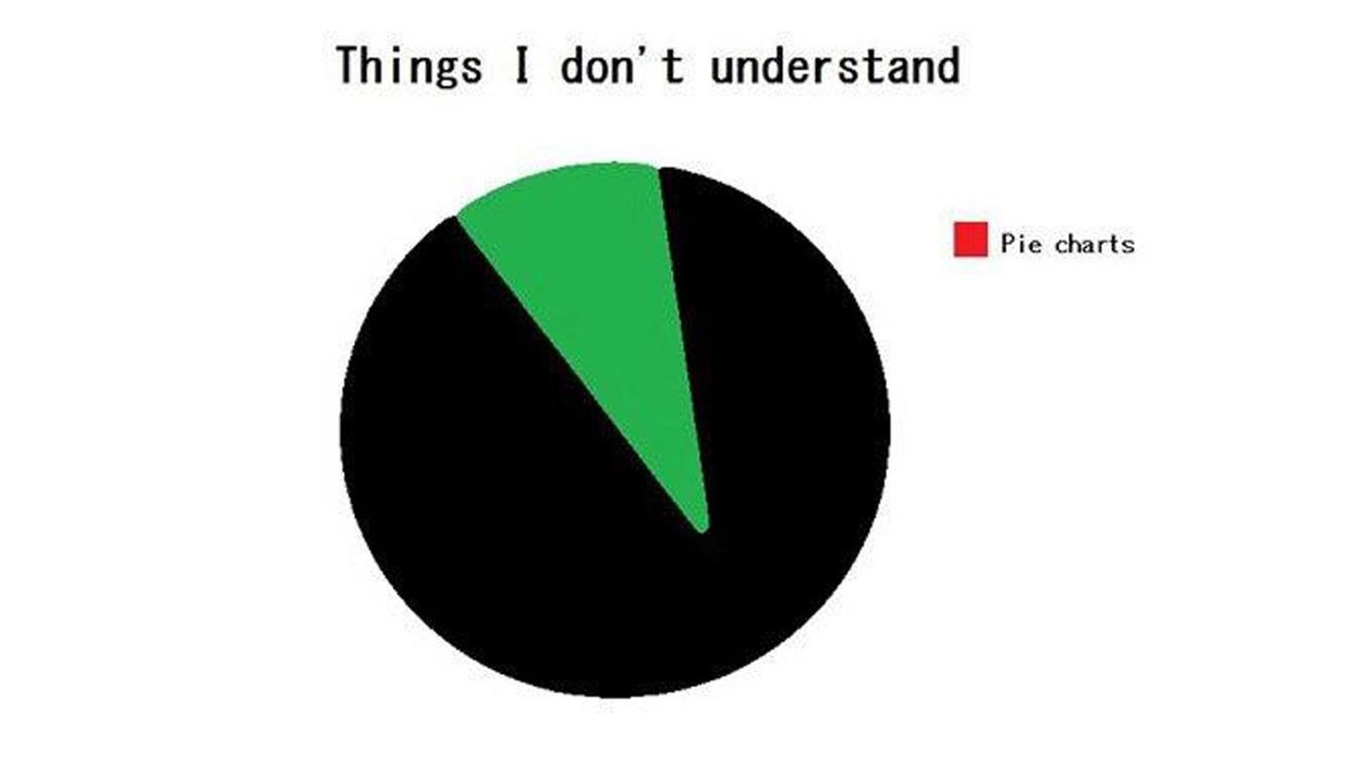
13. The ultimate pie chart
14. An extremely useful map of every pub in the UK
What a mess.
HT data_irl
More: How Labour is failing under Jeremy Corbyn, in 8 charts
More: 21 maps and charts which will challenge perceptions of Europe