


The Conversation (0)
Viral
‘Mansplaining’ is such a common practice that it even has its own dictionary entry.
According to the Oxford Dictionary, its definition can be loosely summarised as “a man explaining something to someone, typically a woman, in a manner regarded as condescending or patronising.”
Unsurprisingly, the term became the subject of controversy earlier this year when millions flocked to Google to ask whether or not it’s sexist. Spoiler: it isn’t.
But it can be difficult to know when you’re mansplaining – after all, even the most well-intentioned advice can come across as patronising, and those unsolicited nuggets of wisdom you just can’t help but lavish upon women might just get you into trouble.
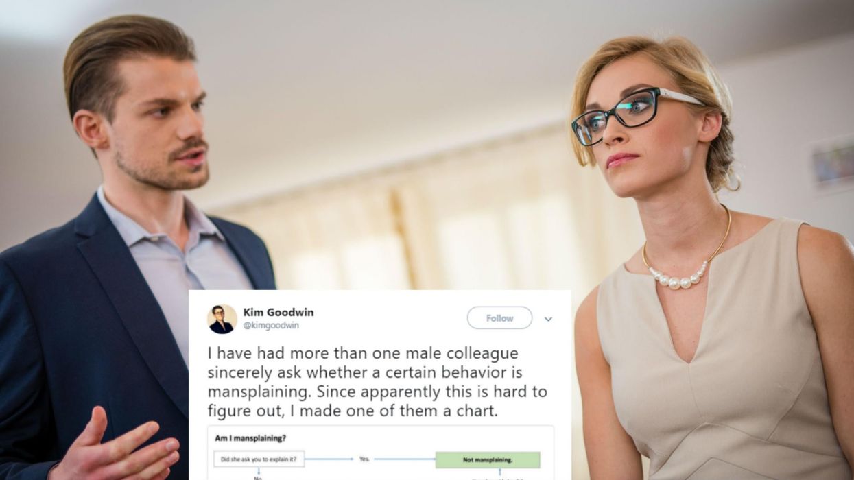
Luckily, author and researcher Kim Goodwin did everyone a favour this week by creating a handy chart, initially intended for a male co-worker, and then sharing it to Twitter.
Unsurprisingly, a man then responded to explain – without noting even a hint of irony - that what she was actually defining was “condescending behaviour that can happen in any human interaction, regardless of gender”.
He rounded off his tweet by calling the chart sexist, and then adding the hashtag #notallmen.
This is obviously true. Anyone can be patronising, or condescending.
But what he seemed to miss was the fact that the vast majority of work environments are dominated by men, a ratio which then creates a structure of power. As men are usually at the top of these food chains – although, thankfully, the ratio is beginning to change – ‘mansplaining’ becomes a power move, not an apolitical interaction. There’s a deeper dynamic at play.
Goodwin also responded by also pointing out that she was referring to ‘gendered behaviour’, and that nowhere did she implicate ‘all men’ as perpetrators of ‘mansplaining’.
What’s interesting to note is that men and women tended to react extremely differently to the chart.
Men generally tended to either take offence, or to argue that the issue shouldn't necessarily gendered, whereas women most often loved the chart and felt they could relate to it.
Ironically, there was also a whole lot of mansplaining going on further down the thread - proof that more charts like Goodwin's are still sorely needed.
More: This 'mansplaining' advert outside an Australian university is getting mocked online