The Conversation (0)
Picture:
Carto/indy100
We previously battled counties in Britain and countries in Europe. Now we've taken on the world and won.
We're of course referring to maps using Google's autocomplete responses.
As previously noted, the autocomplete function can reveal underlying stereotypes about an area, based on what people search about it:
Don't say no one predicted Brexit.
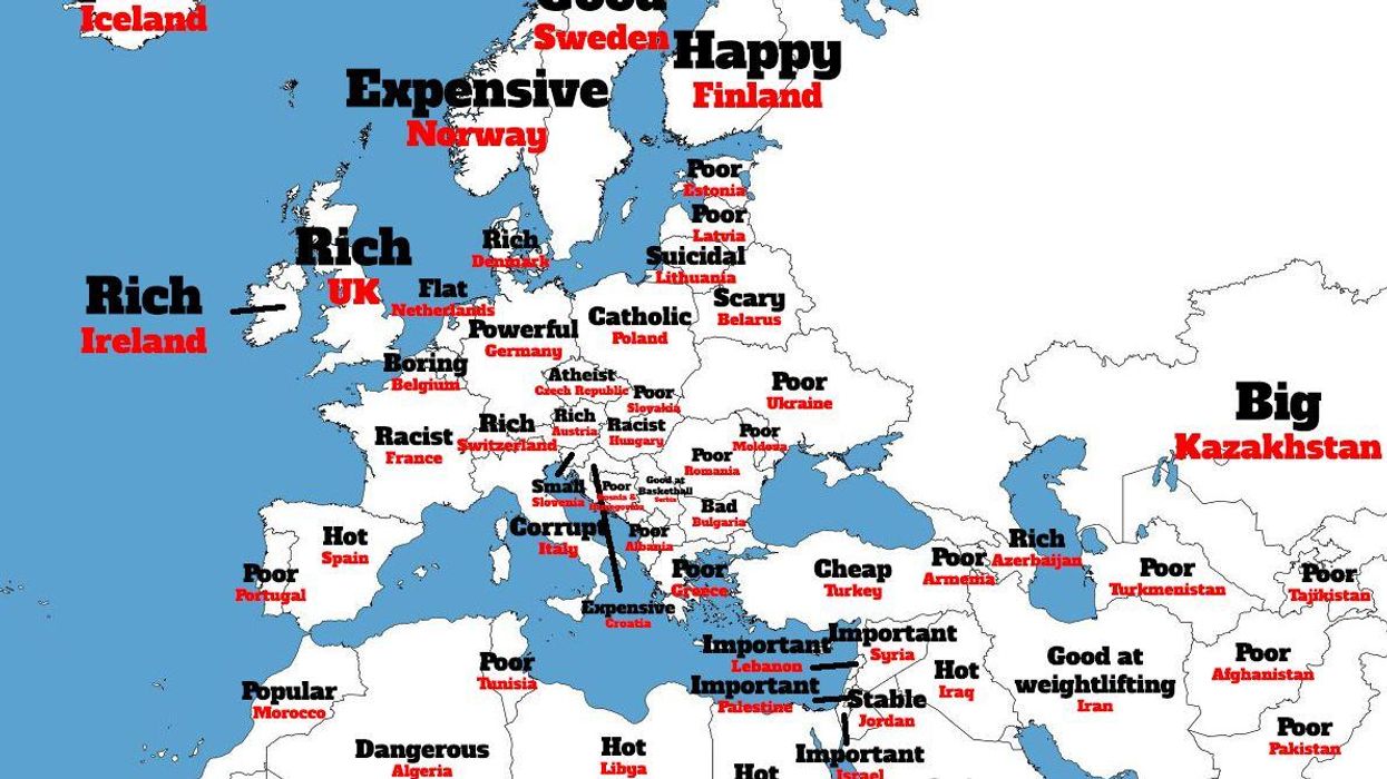
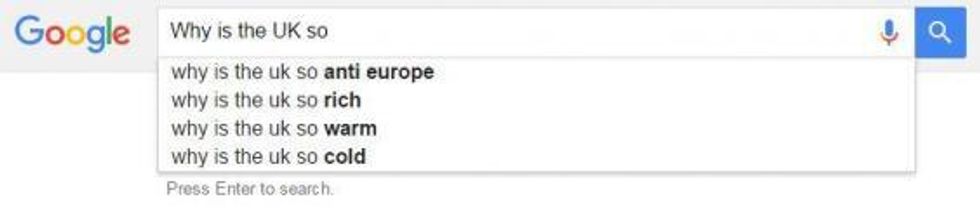
Using a similar method completely beyond scientific reproach, we ran each country through UK Google's autocomplete function, using the format:
Why is [country] so...
Here's the resulting map:
Alternatively you can see a full sized version of the map in your browser, here.
Some countries didn't return results due to their size - or simply not enough people were searching about them to trigger a suggestion.
One overwhelming takeaway is our impression of Africa and parts of Asia as simply "poor".
Meanwhile the description of the United States as 'divided' could be in reference to the current presidential election, which has stirred up iseas surrounding multiculturalism, police shootings and for whom the economy works.
Meanwhile the United Kingdom is simply described as "rich", which we imagine Mark Carney will be pleased with.
More: The British stereotype map of Europe (according to Google)
More: The stereotype map of Britain's counties, according to Google autocomplete results
Top 100