The Conversation (0)
News
Statistics and headlines about immigration tend to focus on the number of migrants in a country – but another interesting way to look at the topic is levels of emigration from a country.
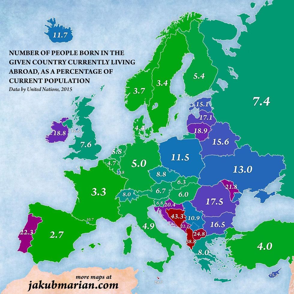
Jakub Marian has published a map according to the number of people born in a country who live abroad, as a percentage of the current population.
Here's the map:
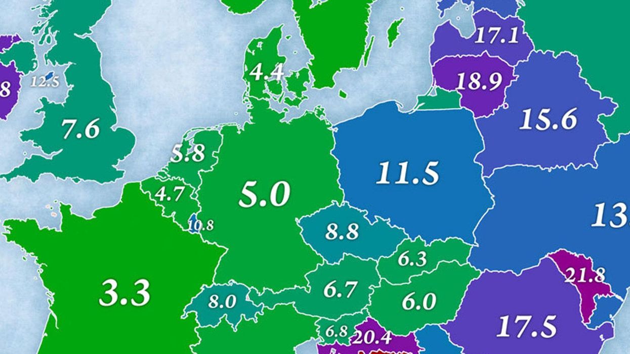
 Picture: Jakub Marian
It shows that 7.6 per cent of UK citizens currently live abroad, compared with 18.8 per cent in Ireland, 13 per cent in Ukraine, 22 per cent in Portugal, 3.4 per cent in Sweden and 18.9 per cent in Lithuania.
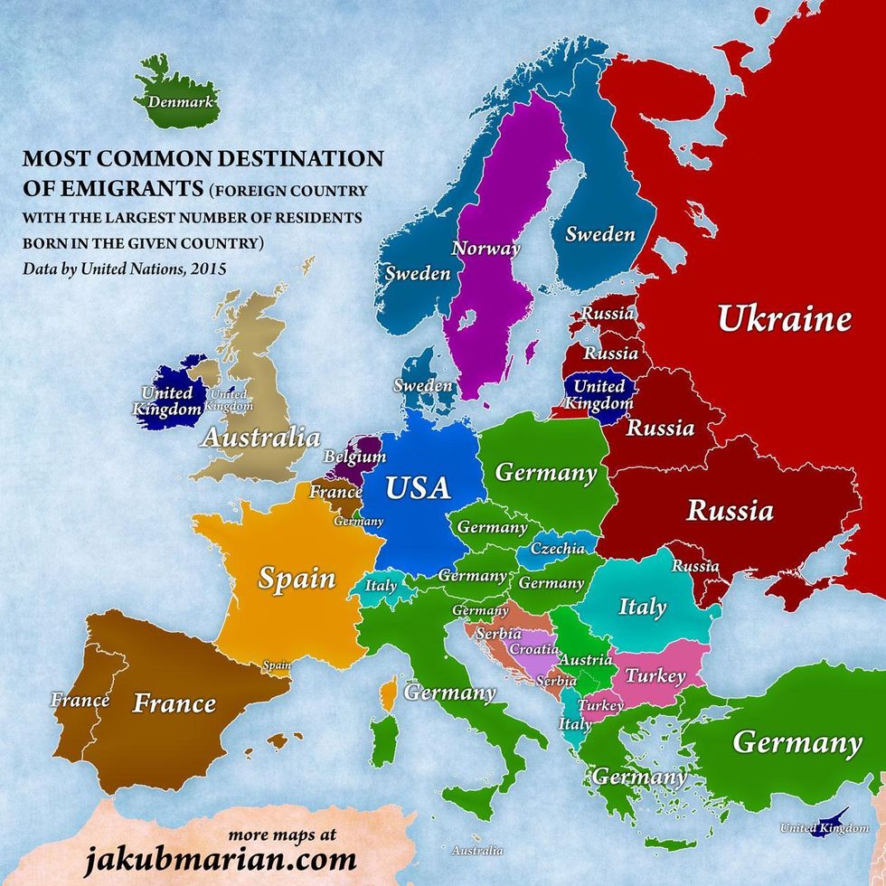
In a separate map, you can see the most common destination of emigrants in each country:
 Picture: Jakub Marian
This map shows that more Australia emigrate to England than anywhere else, and more Americans emigrate to Germany than any other country.
More: This great map lets you explore the history of migration for every single country