The Conversation (0)
News

The UK has committed to spending 0.7 per cent of its GDP, which amounts to roughly £12bn, on foreign aid each year.
In comparison, the US provided $35bn (£23.2bn) to more than 140 countries in the past fiscal year.
While many would assume that these funds are spent on development in poor countries, this map from cost information website How Much reveals something different.
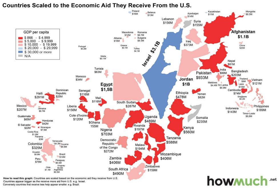
The size of each country, of which only the top 77 recipients are shown, corresponds to the amount of aid it receives from the US and its colour depends on the size of its GDP per capita.
These are the top 5 recipients of US foreign aid:
Israel: $3.1 billion
Egypt: $1.5 billion
Afghanistan: $1.1 billion
Jordan: $1.0 billion
Pakistan: $933 million
Israel is currently the top recipient of US foreign aid (around 9 per cent), and according to the US government Foreign Assistance report, spends all £3.1bn of that on its military and defence.
Similarly, Egypt, the second highest recipient spends £1.3bn of its £1.5bn on defence, although the following three of the top five spent a higher percentage on development.
Note: Gaza, but not the West Bank, has been incorporated into Israel on this map. i100.co.uk has contacted How Much to find out why and will update the article accordingly.
More: The five biggest recipients of foreign aid from the UK