News
David Schwartz
May 15, 2016

As a geographer I have an affinity for maps that grew out of a deep love for them. So lets's share:
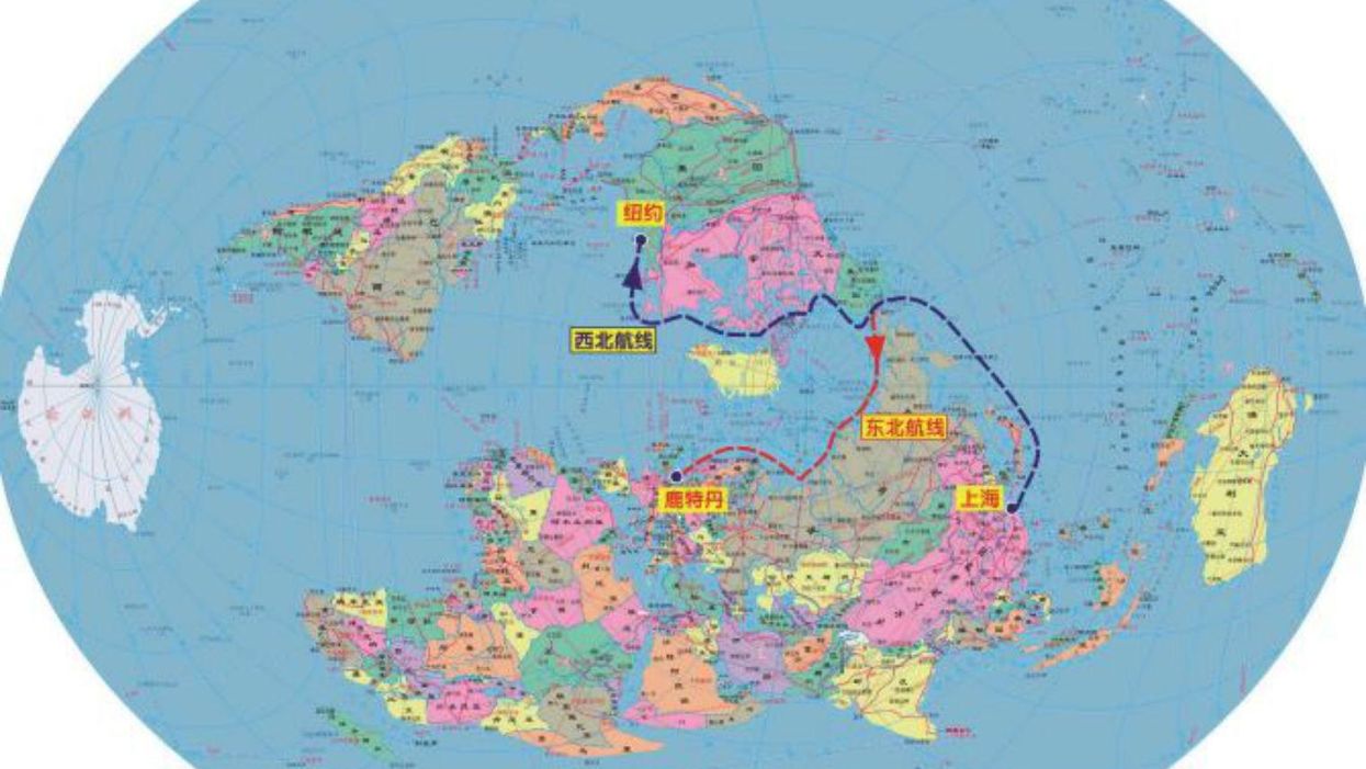
1. One of my favourites is this map of how China sees the Arctic:
Picture: SIPRIThe opening of Arctic waters offers China, and many others, new options in the way of maritime routing as more channels become open. Furthermore, maps like this help put paid to the idea that nothing is changing in the Arctic since people with a great deal of money are banking on that change occurring.
2. A sunken city you may not know about:
Picture: Touching the TideWelcome to Dunwhich, which about 700 years ago was a major port on the east coast of England. However, due to its place on the coast there was a powerful wave action in effect which slowly wore away the city and reduced it both is size and stature. There is much more to this map but this is the one based on current vector data. There are older layers going back to about 1,000 years ago but that data is not available yet.
3. How about mapping a military victory?
This is a map, specifically a geovisualisation, that depicts six forms of data: troop size, direction of travel, latitude and longitude, temperature during the retreat, and position.
These are all used to depict Napoleon's advance and retreat from Moscow and do a much better job than just lines on a map. While it may not look like a traditional map it is one with all the spatial aspects required to qualify but it is laden with very specific and targeted information that shows how uniquely flexible maps can be.
The text in French for those who cannot read that language:
Figurative Map of the successive losses in men of the French Army in the Russian campaign 1812-1813.
Drawn by Mr. Minard, Inspector General of Bridges and Roads in retirement. Paris, 20 November 1869.
The numbers of men present are represented by the widths of the coloured zones in a rate of one millimetre for ten thousand men; these are also written beside the zones. Red designates men moving into Russia, black those on retreat. — The informations [sic] used for drawing the map were taken from the works of Messrs. Chiers, de Ségur, de Fezensac, de Chambray and the unpublished diary of Jacob, pharmacist of the Army since 28 October.
In order to facilitate the judgement of the eye regarding the diminution of the army, I supposed that the troops under Prince Jèrôme and under Marshal Davoust, who were sent to Minsk and Mobilow and who rejoined near Orscha and Witebsk, had always marched with the army.
More on it here: Charles Joseph Minard, Mapping Napoleon's March, 1861.
4. Another way to look at US presidential elections (2012, to be specific):
Now many cartograms show how much population skews by state and county and how small the populations of those large interior states are but this is a bit different: this shows how many electoral votes are available by state.
Keep the shape of this map in mind, not the colours, come November's election, since you will quickly see a difference between those which are considered desirable states to win and the rest.
More: 8 maps and charts that explain London's place among the world's biggest cities
More: These beautiful maps will change your perspective of the world's coasts
Top 100
The Conversation (0)


