The Conversation (0)
Viral
While some maps can add to our understanding of current affairs, others are praised purely for their aesthetic appeal.
Sadly, there are some maps that are just downright awful...
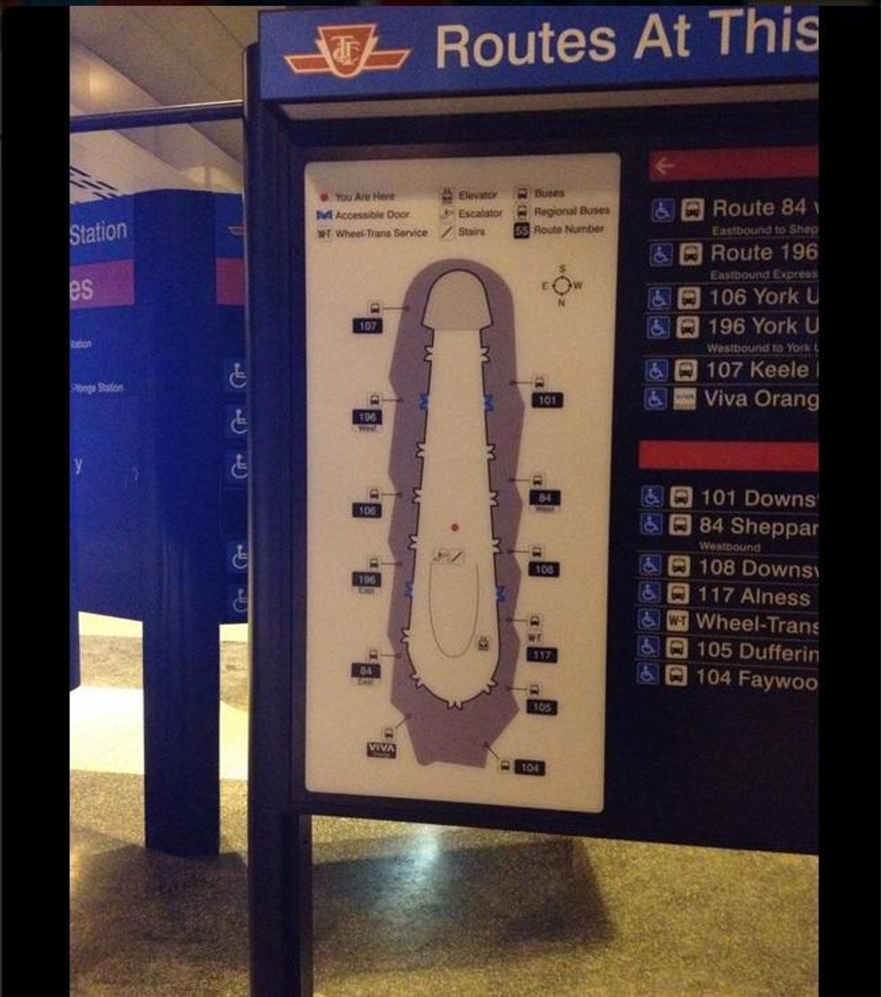
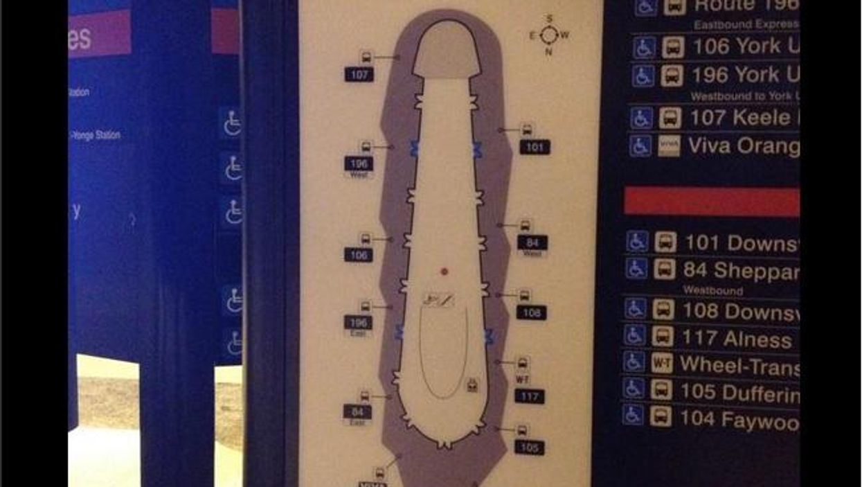
(Picture: Imgur/Spud 79)
As the Toronto Blog pointed out at the time, this map of the city's Downsview bus station depicted it as long and thin and for “some uncomfortable reason” its tip was shaded a different colour.
After being mocked online for its resemblance to a penis, the map was removed by Toronto's transit authority.
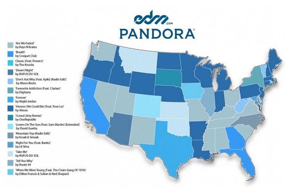
This map from streaming website Pandora attempts to show the favourite dance music tracks in each US state. For some unfathomable reason, its designers chose to use a slightly different shade of blue for each song and make the map near-impossible to decipher.
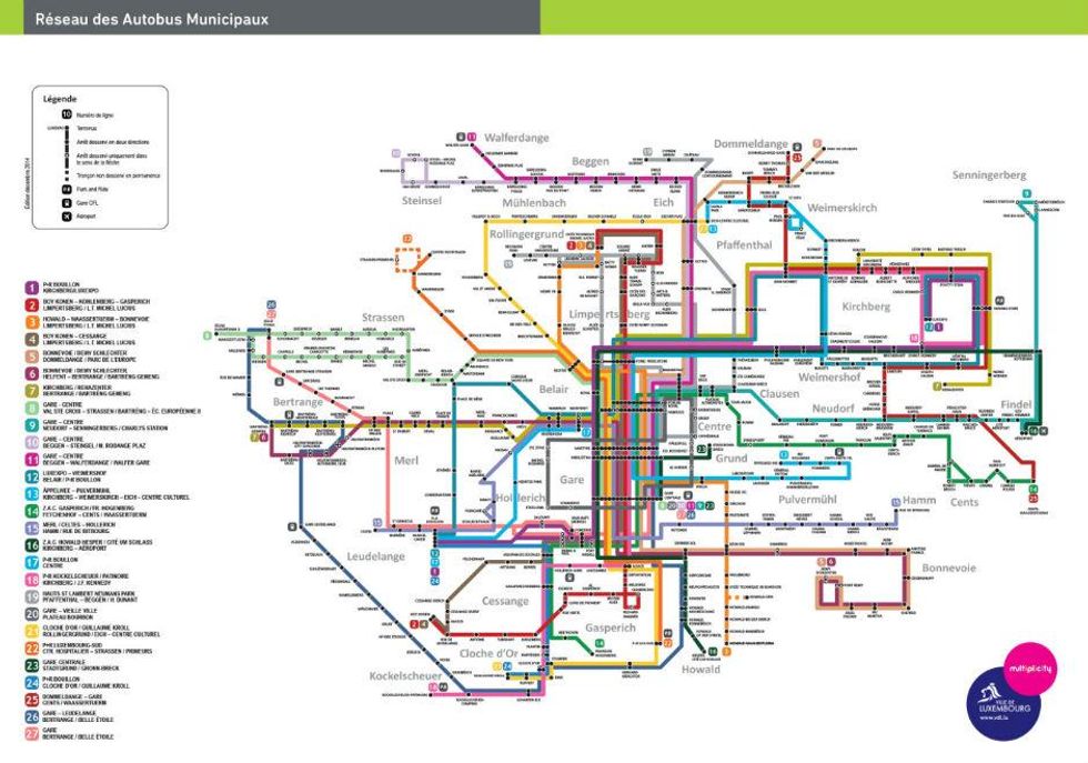
If you ever need to find your way across Luxembourg (city), it's probably best to walk, cycle, or catch a taxi. Basically, use anything but the bus network which features this patently awful map - dubbed “Luxembourg City’s spaghetti monster” by one resident.
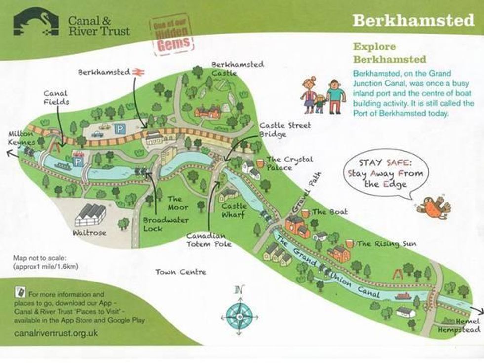
It was supposed to boost tourism for the new but this "family-friendly" map produced by the Canal and River Trust went viral online after almost everyone noticed its resemblance to a massive penis.
"Obviously we’re not going to be setting out to make any maps we produce in future to look phallic," a spokesperson later told the Independent.
Iraq definitely doesn't have a Mediterranean coastline and we're not quite sure what's happened to Israel or Jordan.
According to a map published by the LA Times last July, France had sunk, the Atlantic ocean reached the shores of landlocked Switzerland and the Iberian peninsula had become an island.
The newspaper eventually corrected the map and blamed a "production error" for the gaffe, after lots of indignation in France.
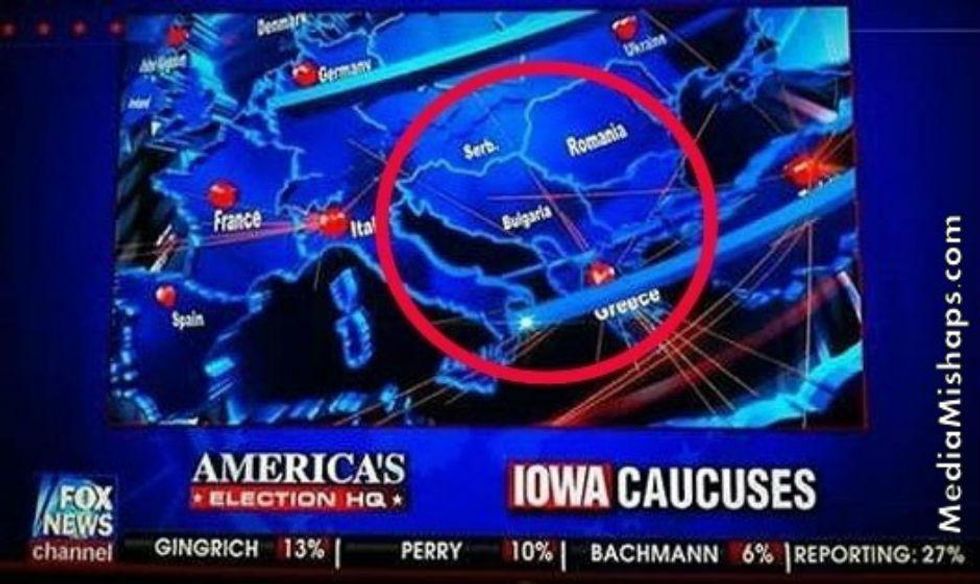
Featuring a reunified Yugoslavia which has been labelled "Bulgaria".
According to this EasyJet promotional poster, the small Greek island of Kefalonia is pretty much the same size as the UK... and in the same shape as Portugal.
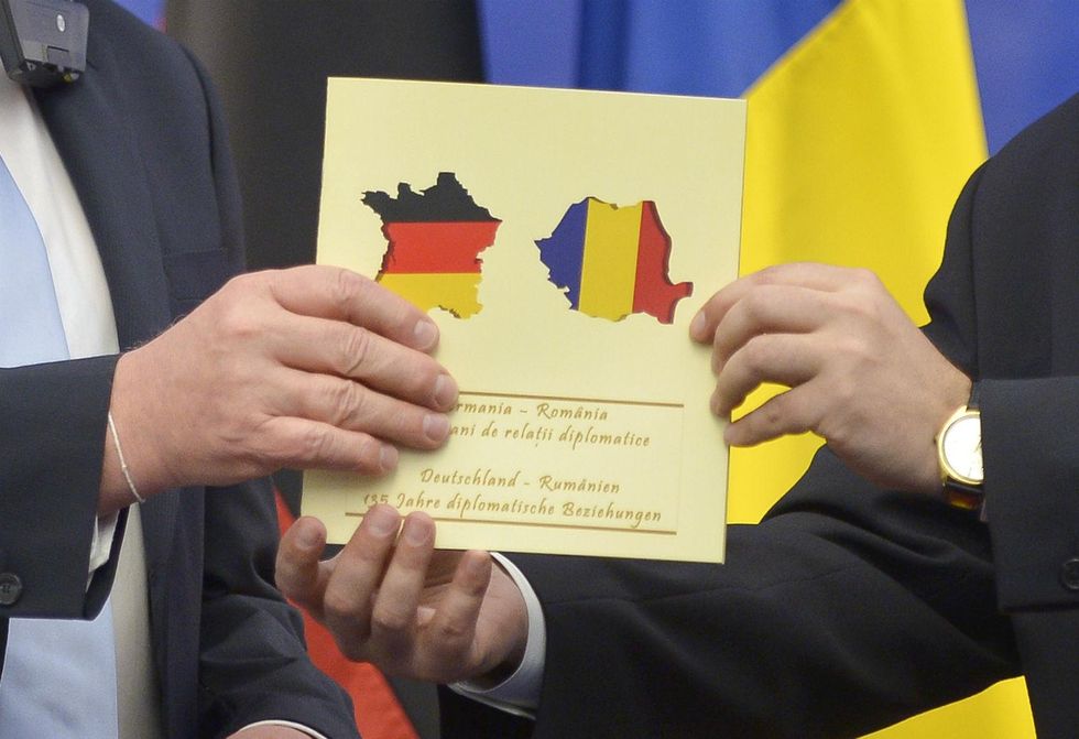
There were red faces in Romanian diplomatic circles after the country's foreign minister handed his counterpart in Berlin a brochure bearing the German flag... in the shape of France.
“The Romanian foreign minister has directly conveyed profound regret for this situation," a statement later explained.
More: 19 maps from which we'll let you draw your own conclusions